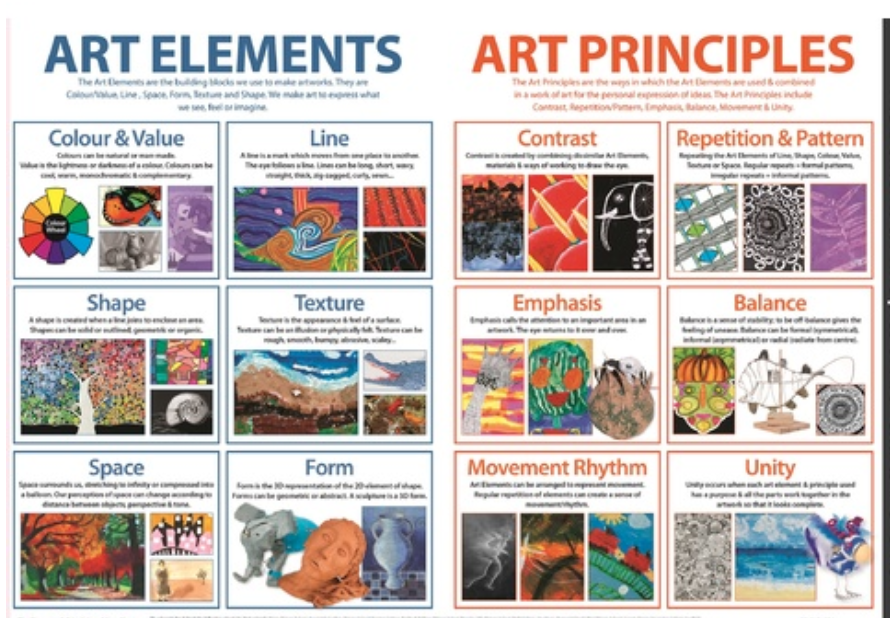
Art Elements - Week of April 7 - 10
Texture, Value, Color
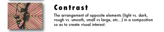
Contrast and Combine Elements
Thank you for sending your art element photos last week when we studied the Art Elements of
Line, Shape, Form and Space in photography.
If you have not yet sent any photos, you must do it now or you will have a grade of "M" for Missing.
Below you will find examples of the 3 remaining art elements we have not yet looked at in photography.
There will be four assignments for the whole week and you will email them by the due date of Friday, April 10.
Choose your best 3 - 5 photos for 1. texture 2.value 3. color and 4. Combine and Contrast all Art Elements
to email to [email protected] by Friday, April 10.
Next week will begin using the original handout with 1-15 photography techniques starting with Rule of Thirds.


|


|

|
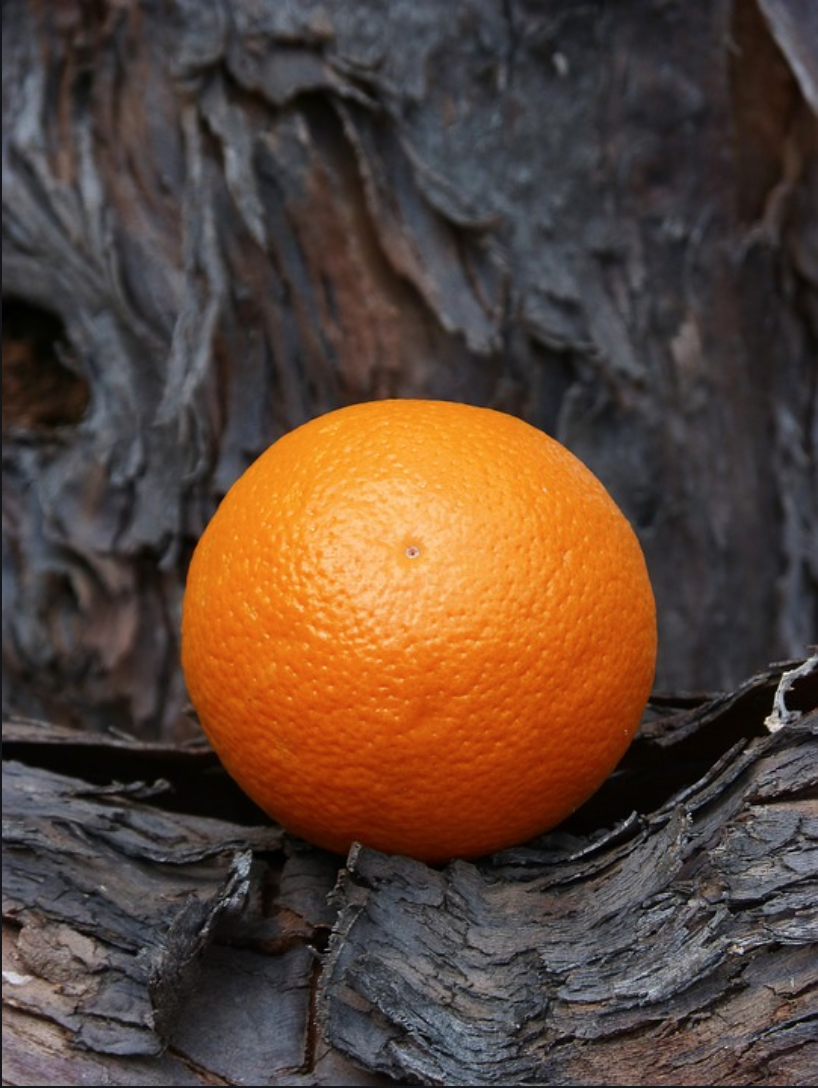
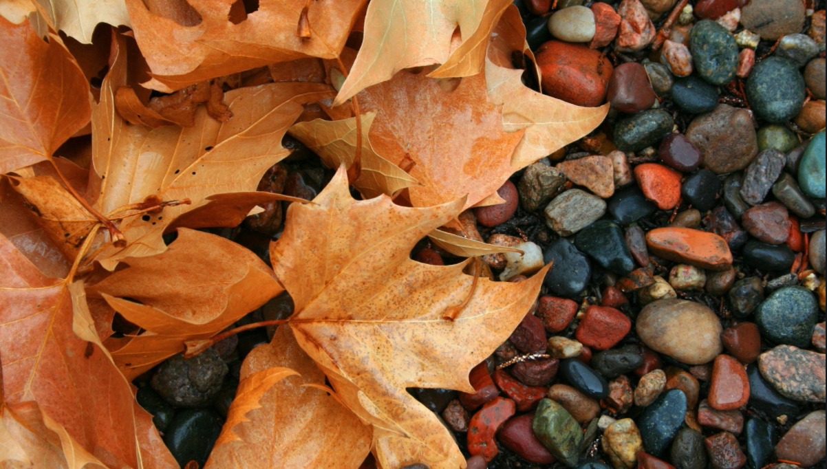
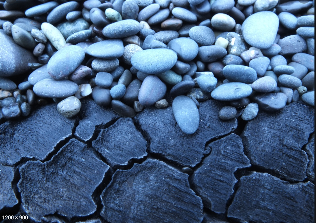
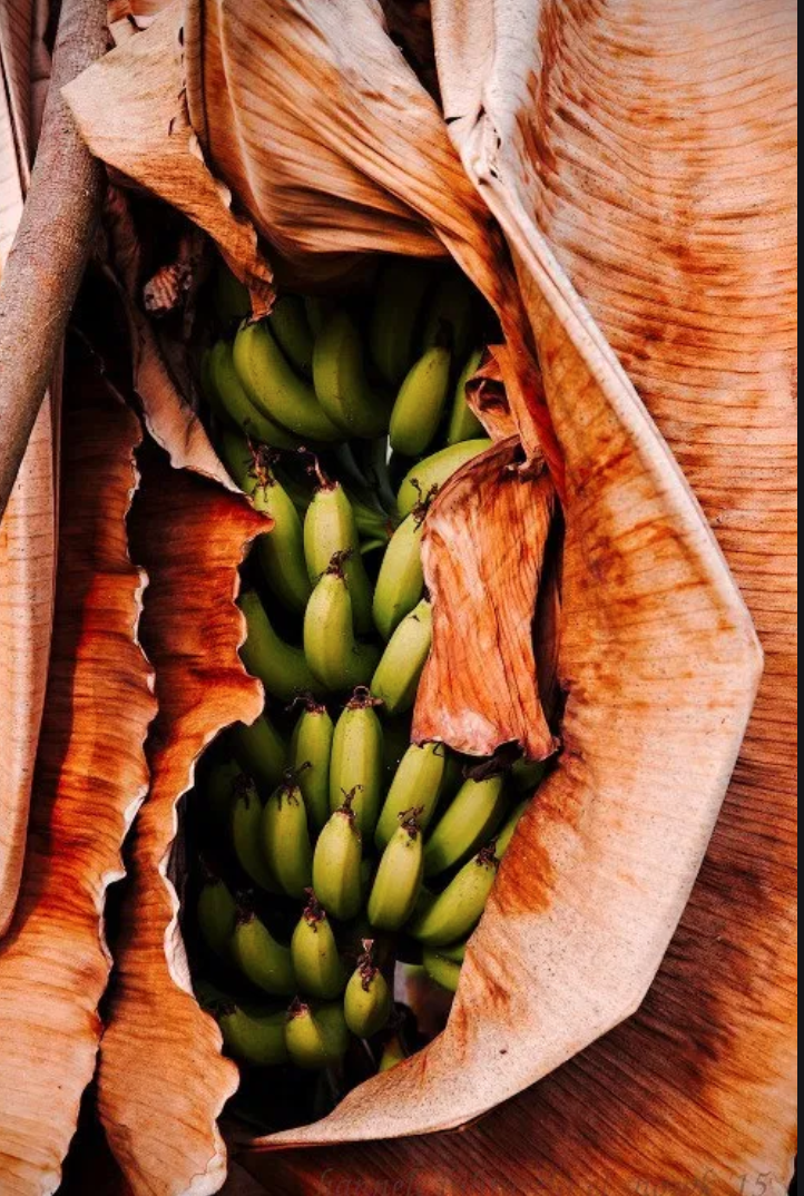
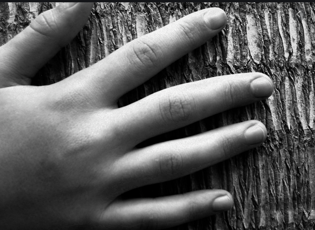
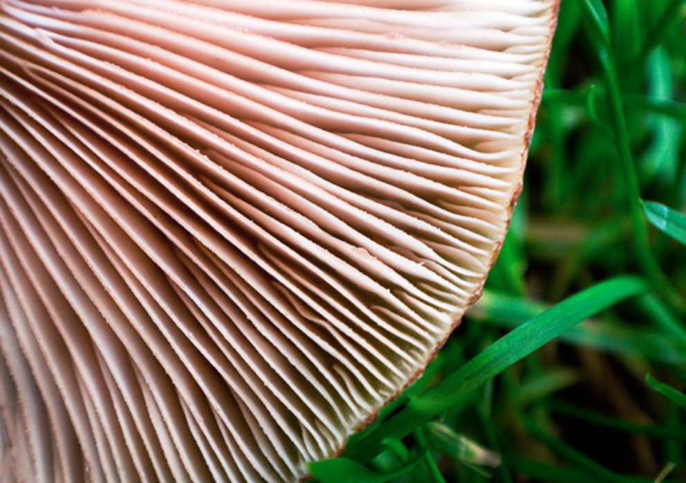
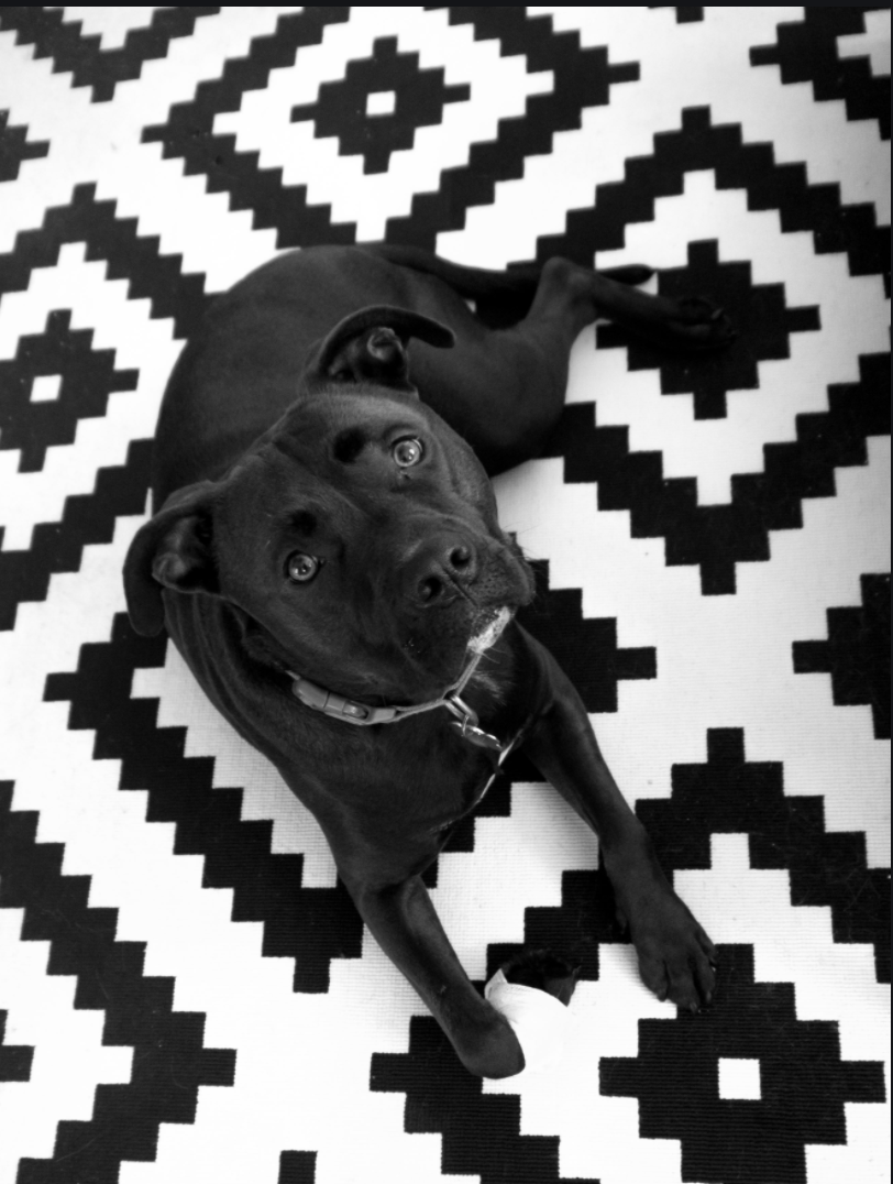
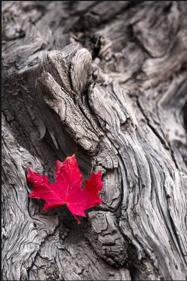
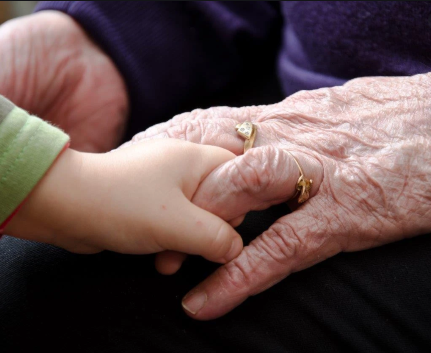
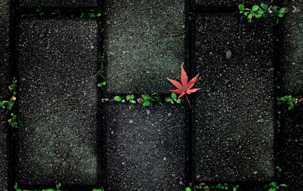
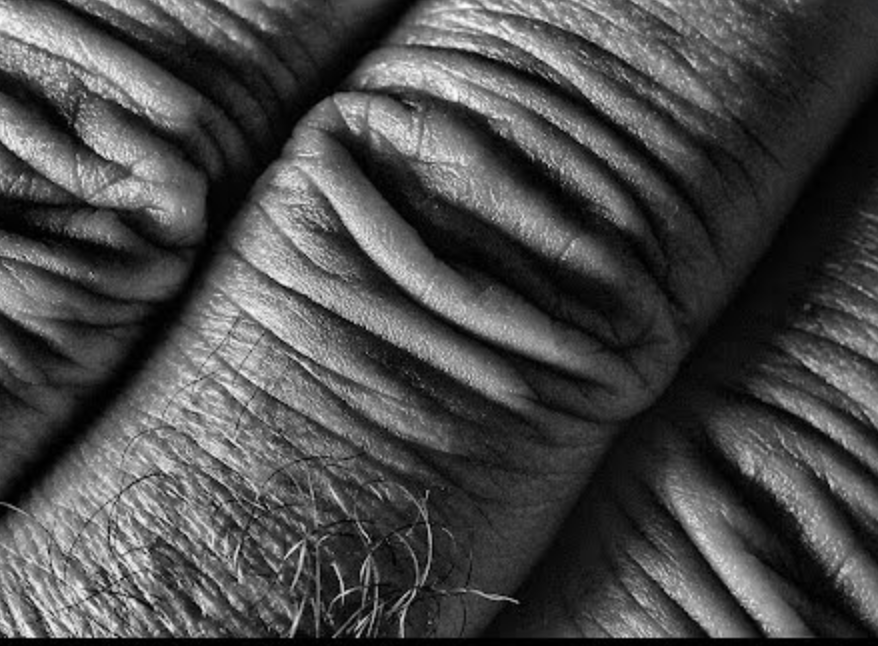
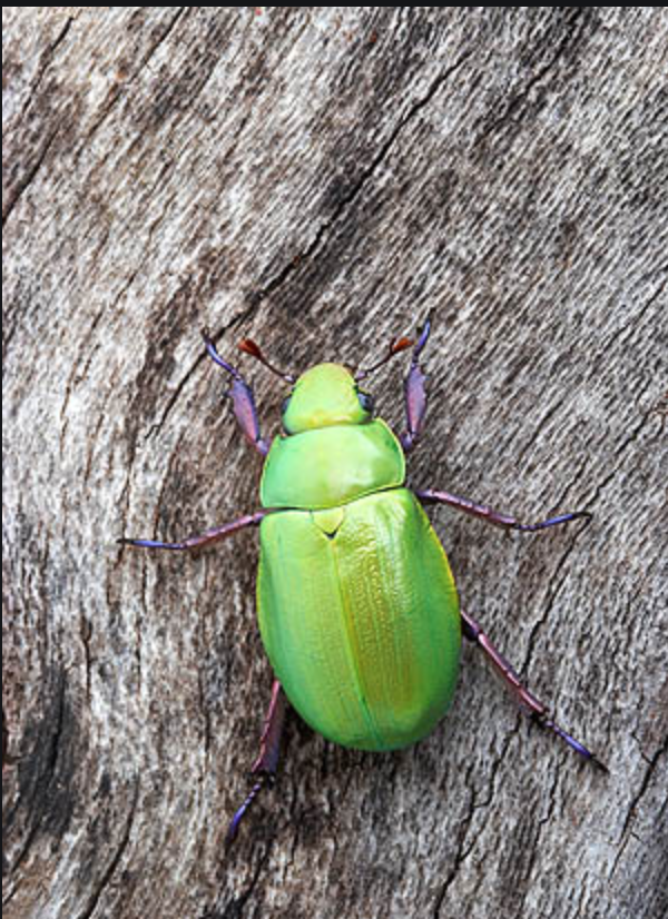
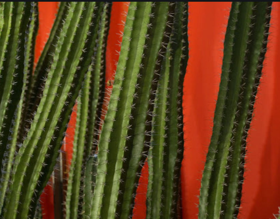
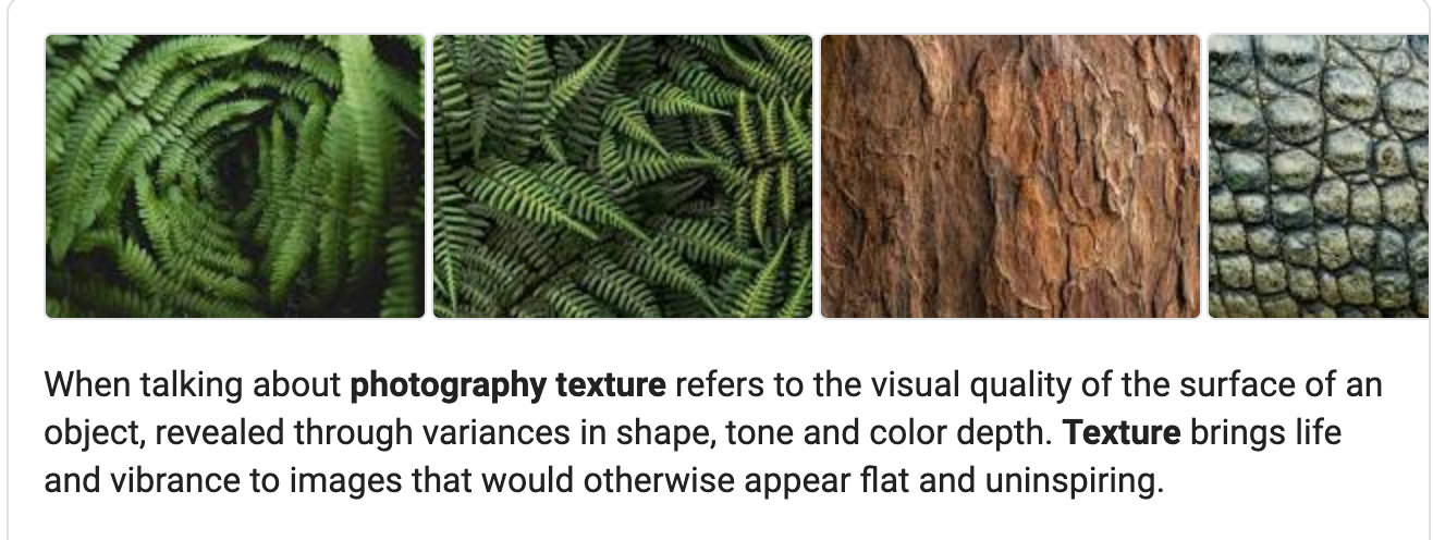
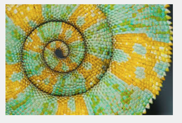
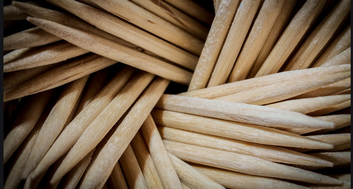
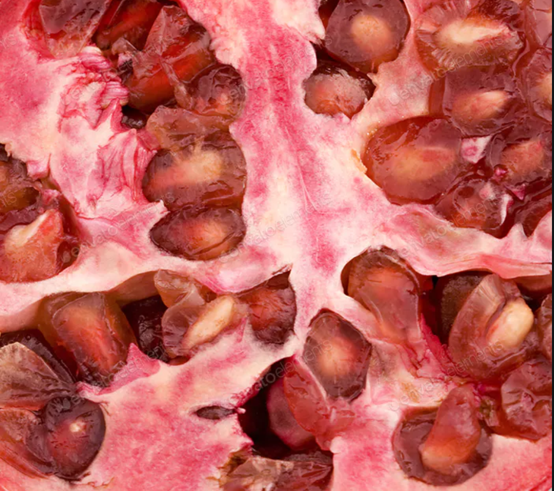
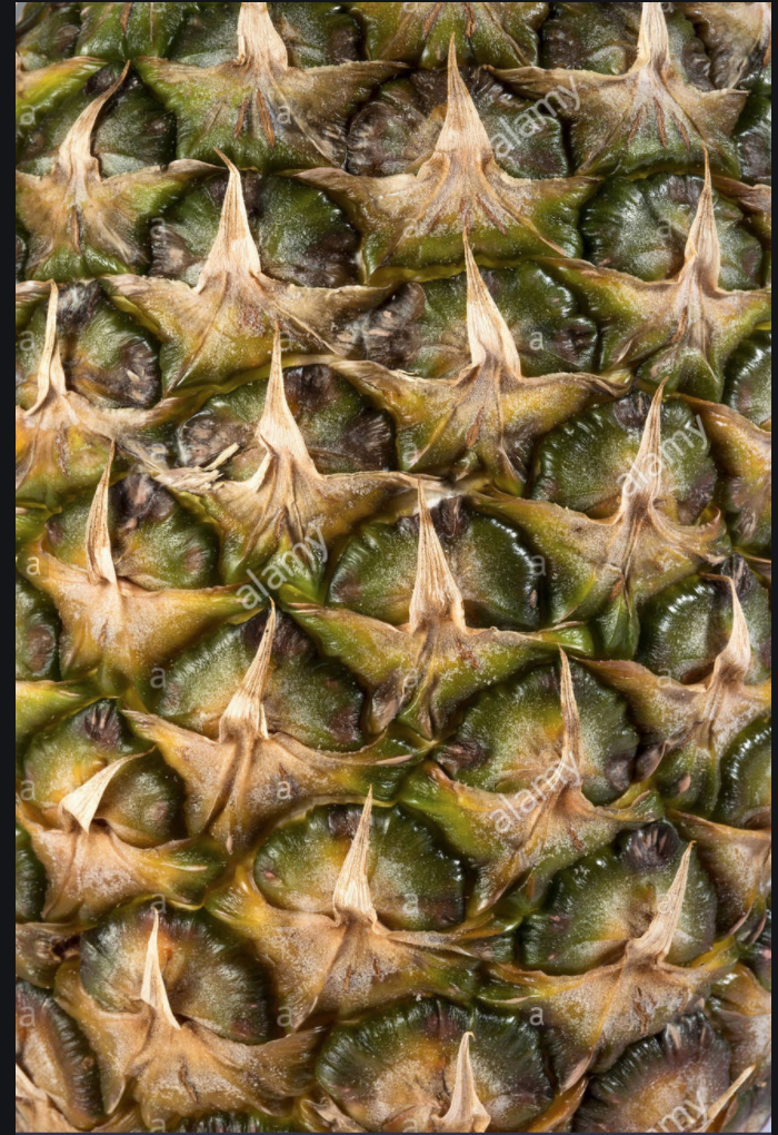
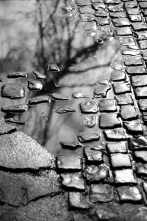
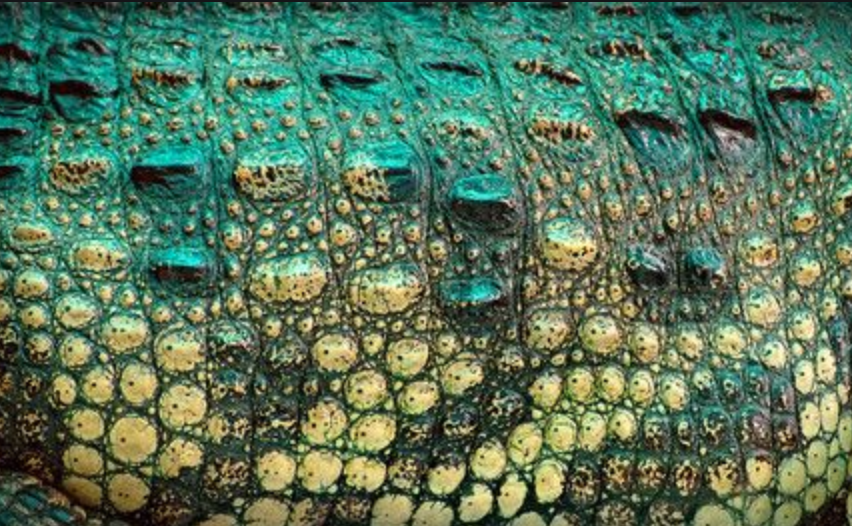
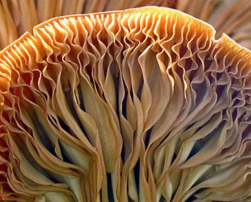
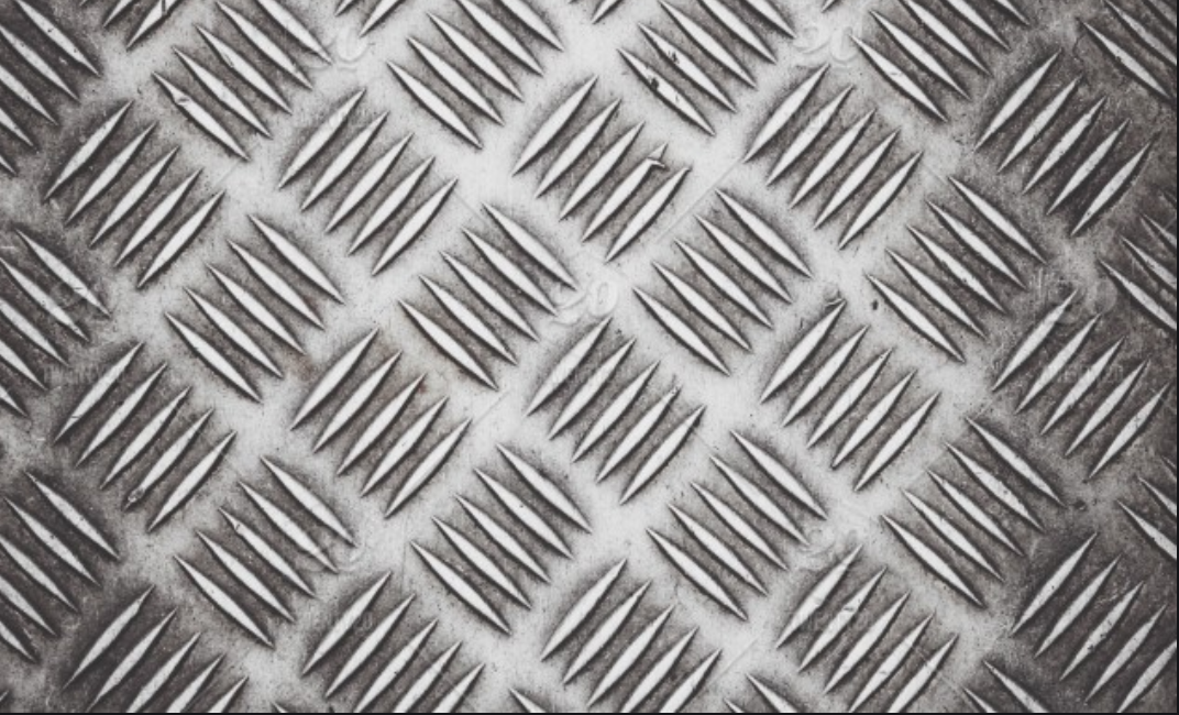
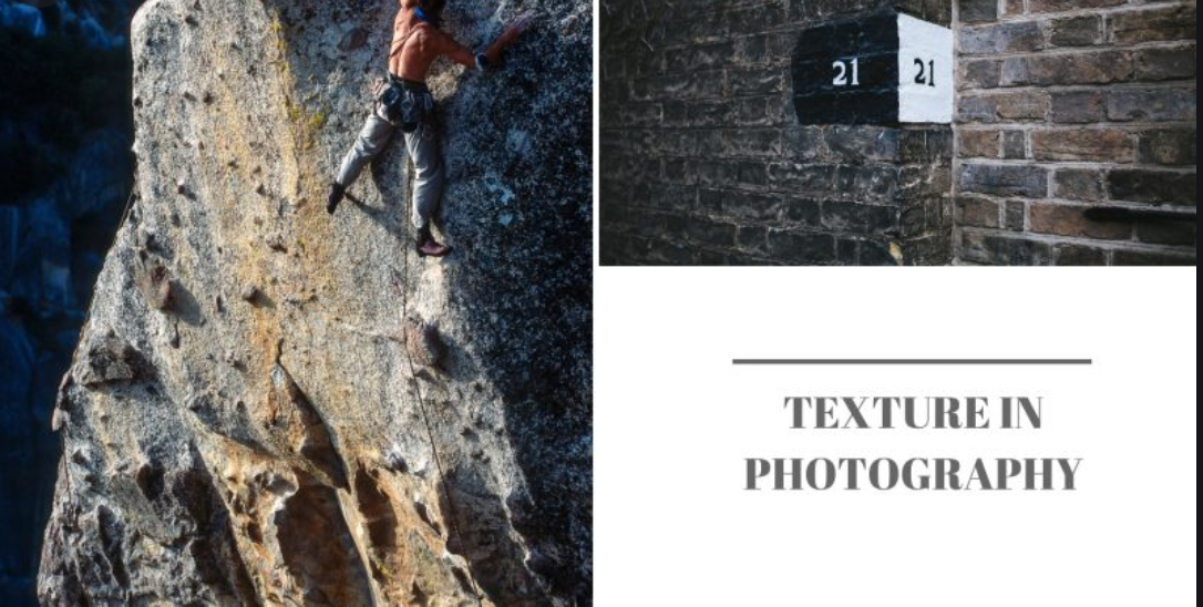
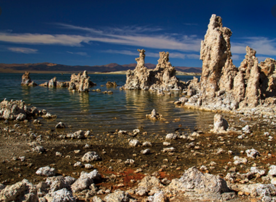
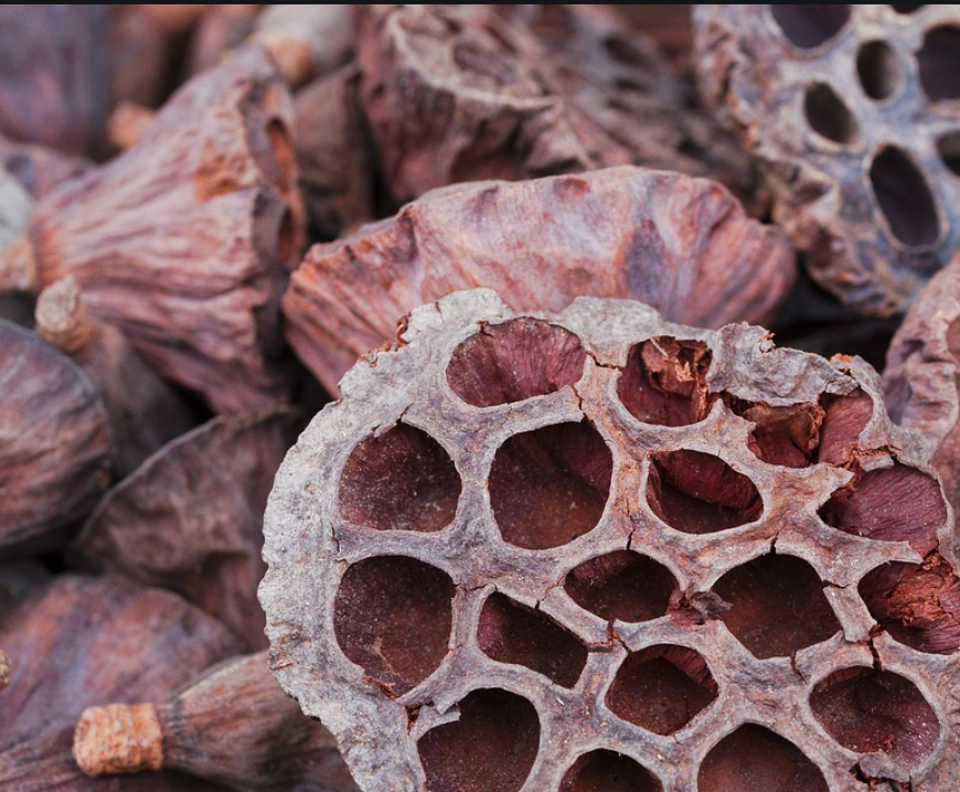
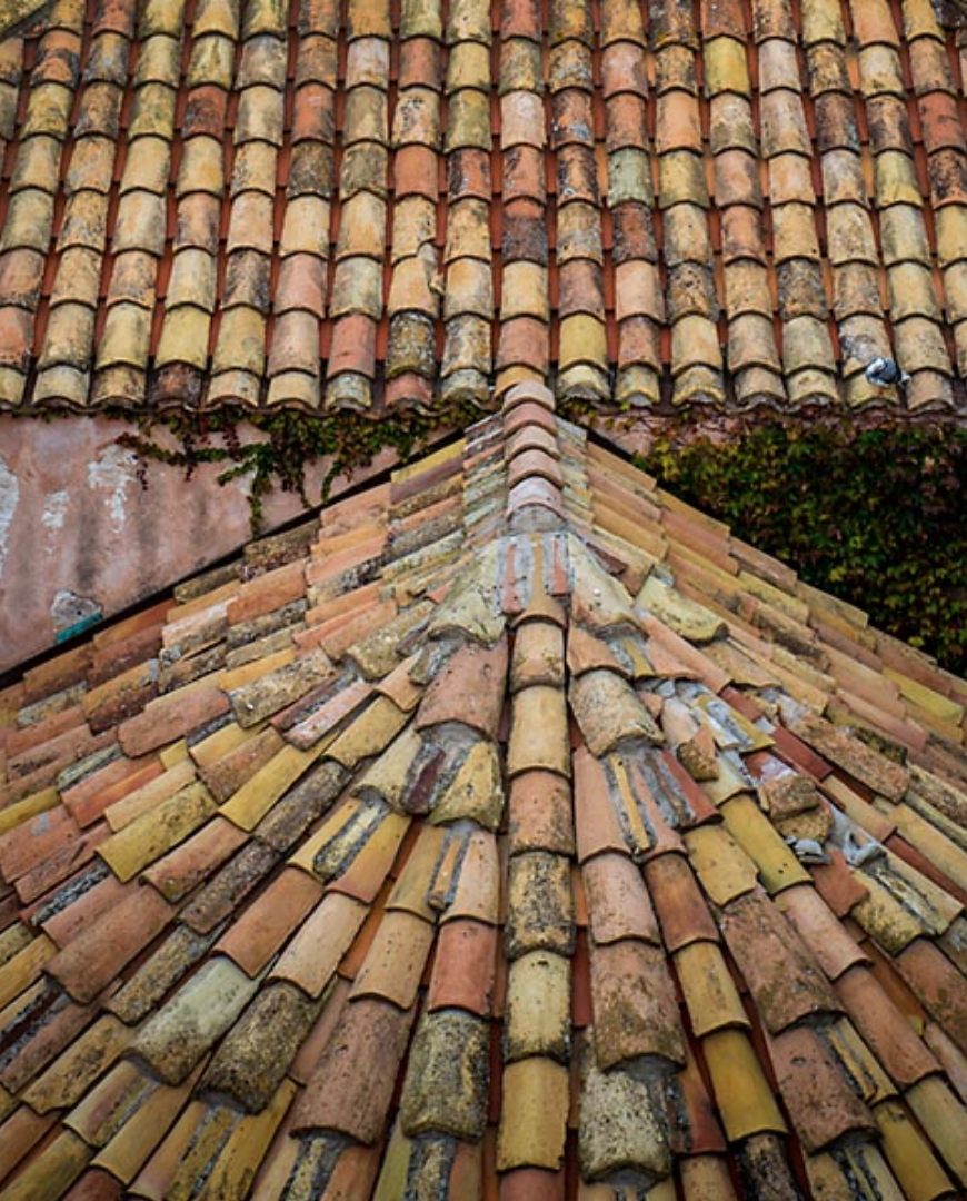
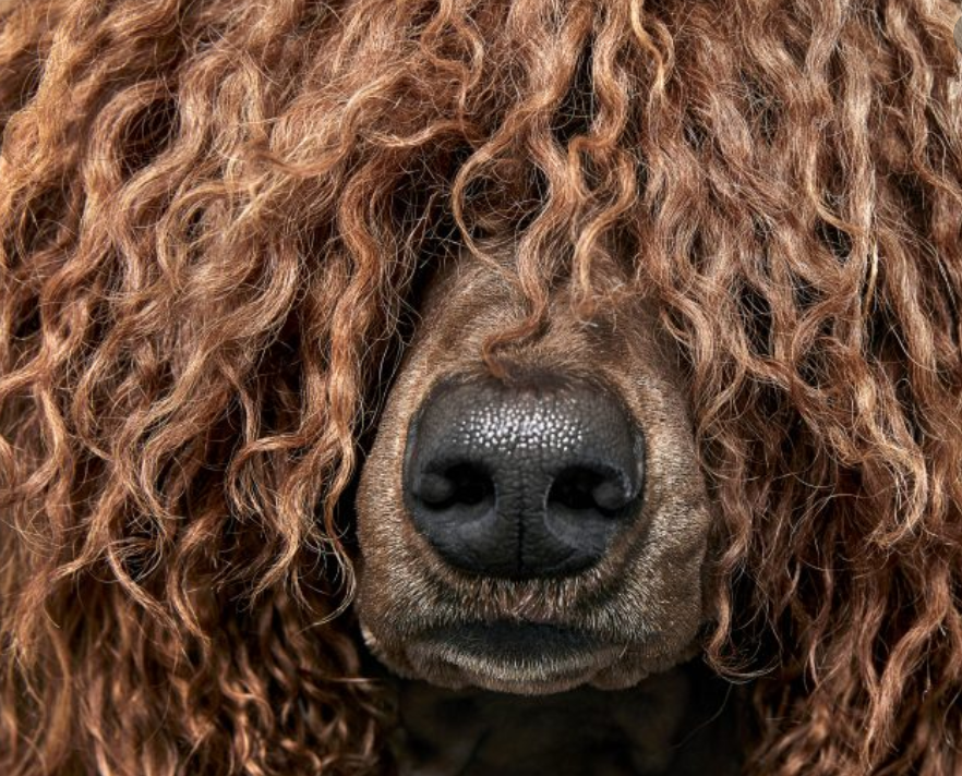
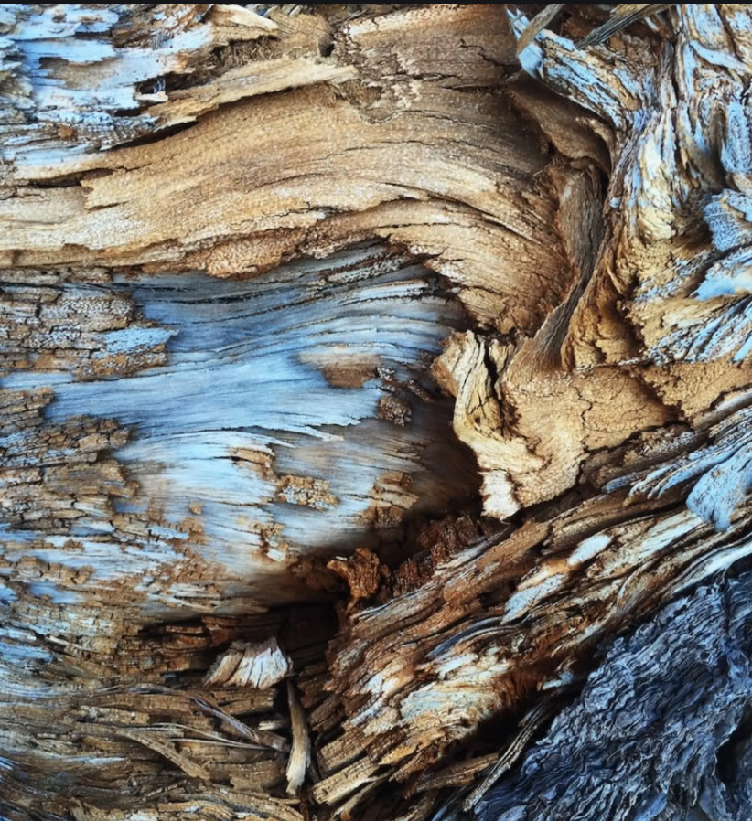
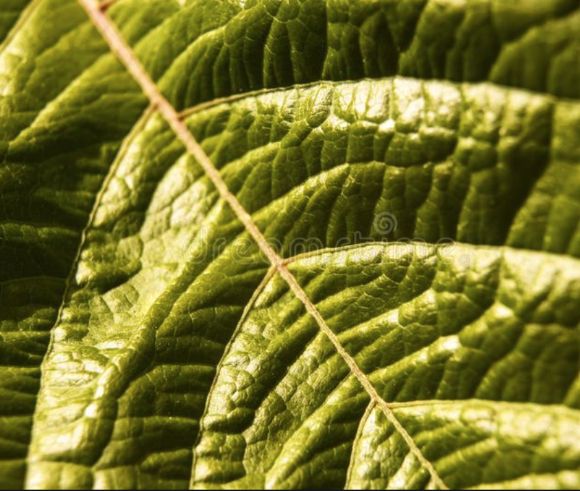
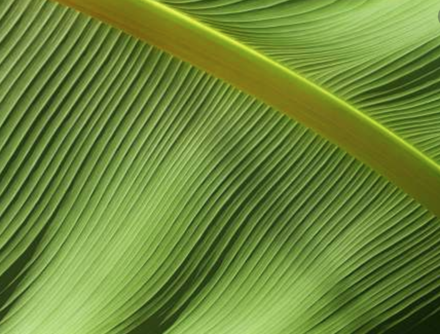
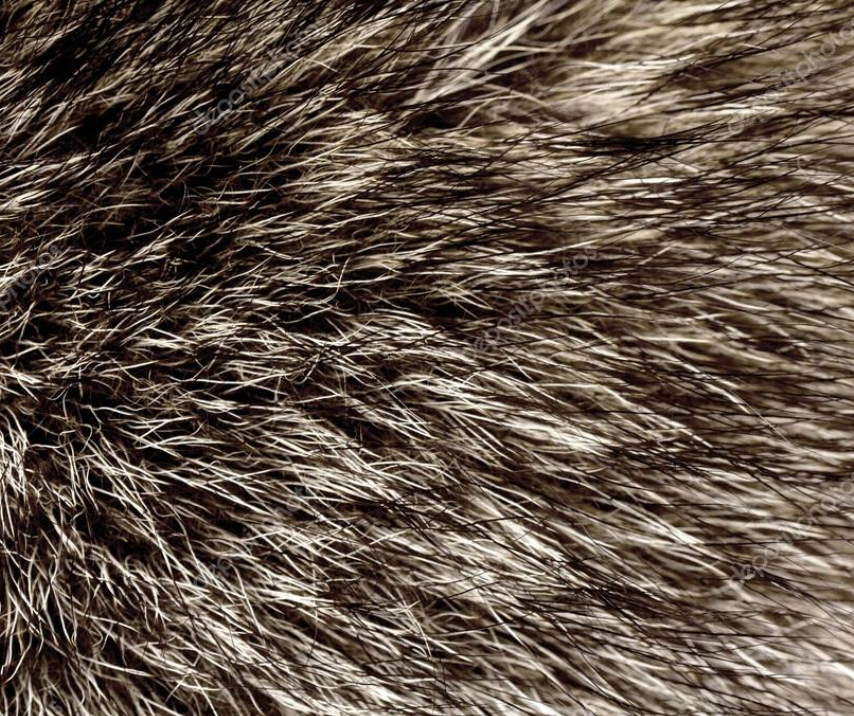
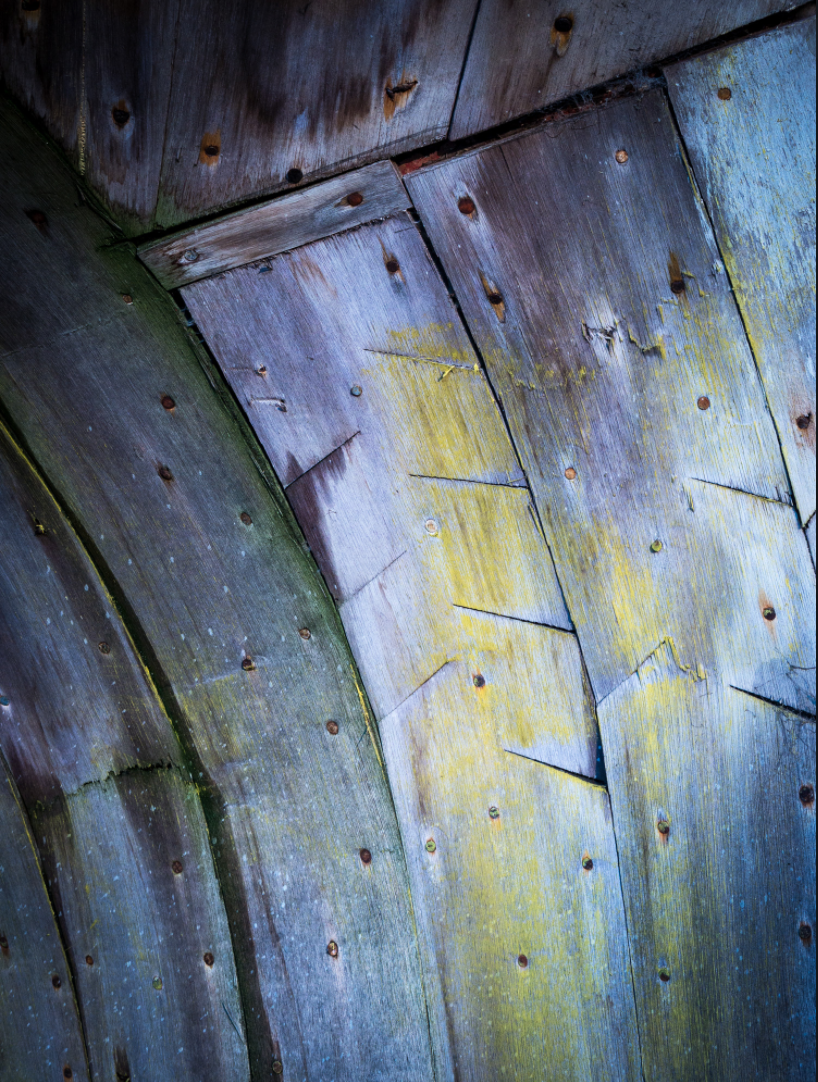
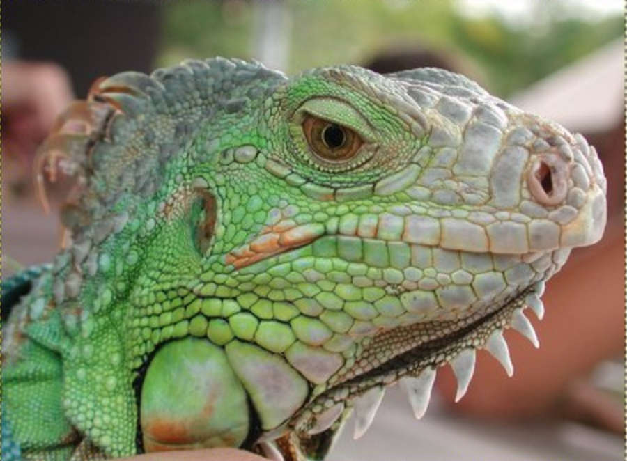
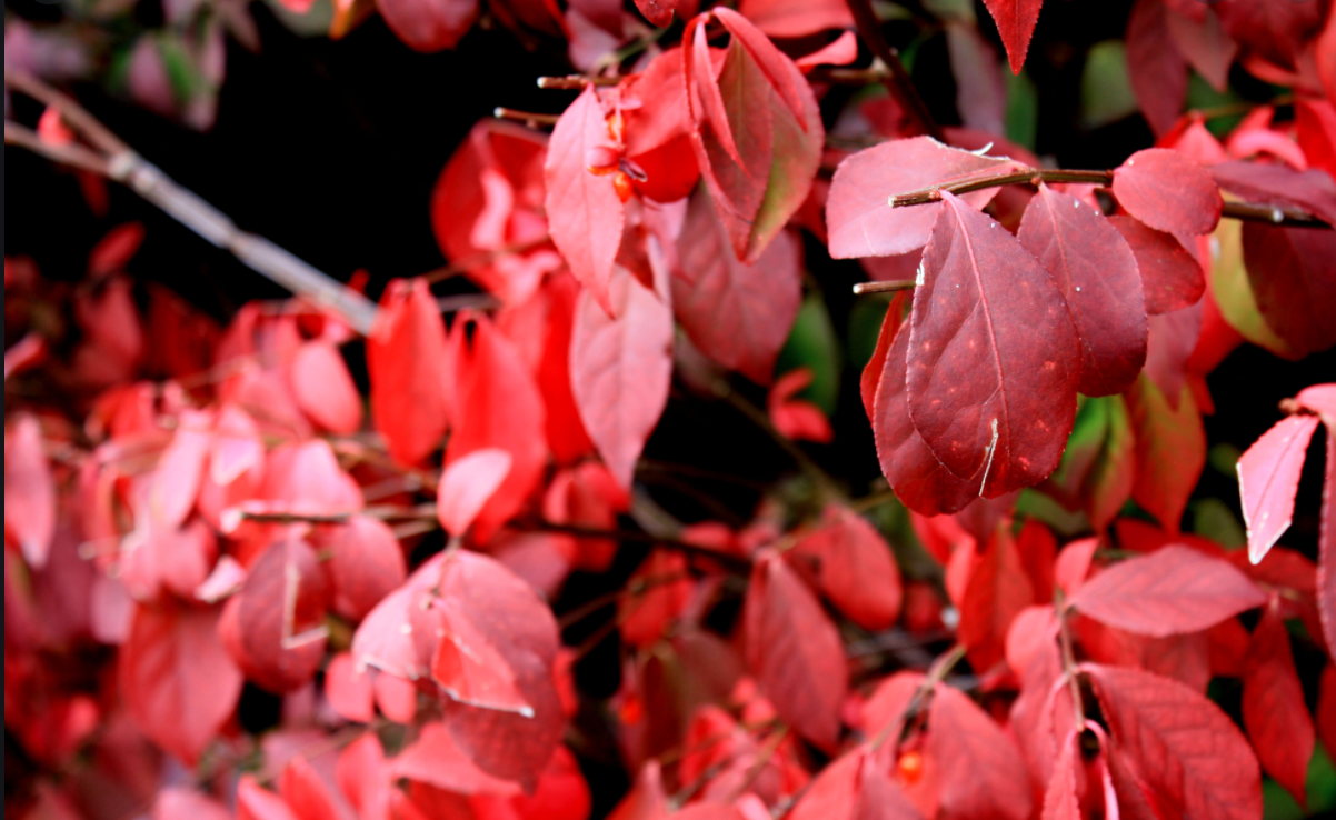
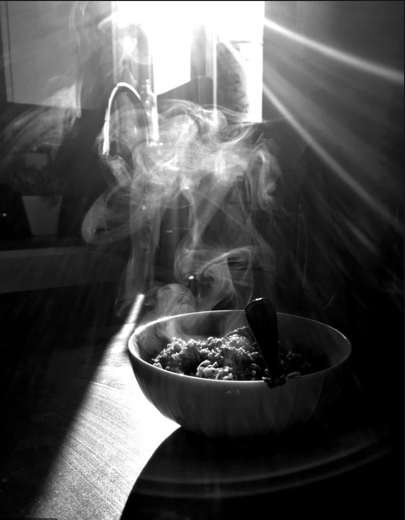
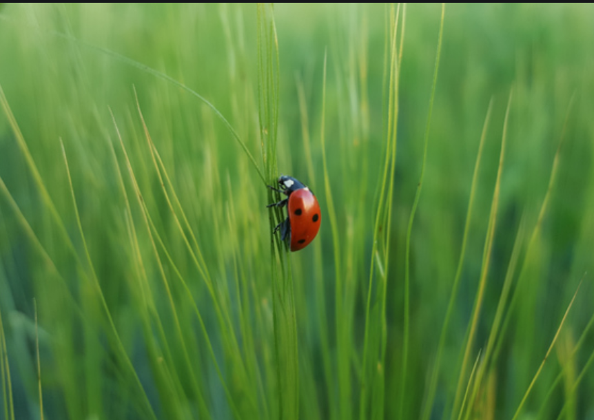
These are only a few examples of using texture and showing how something feels or looks like it feels.
Look around in your world to find interesting examples of texture that can come from nature or from man-made objects.
Assignment #1 for Week of April 7 - 10 - Take photos showing a variety of textures, choose your top 3 - 5 texture photos and email to Ms. Losness by Friday April 10, 2020.
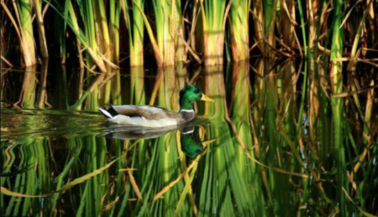
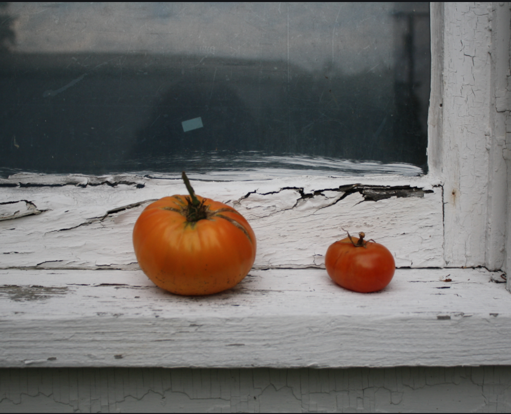
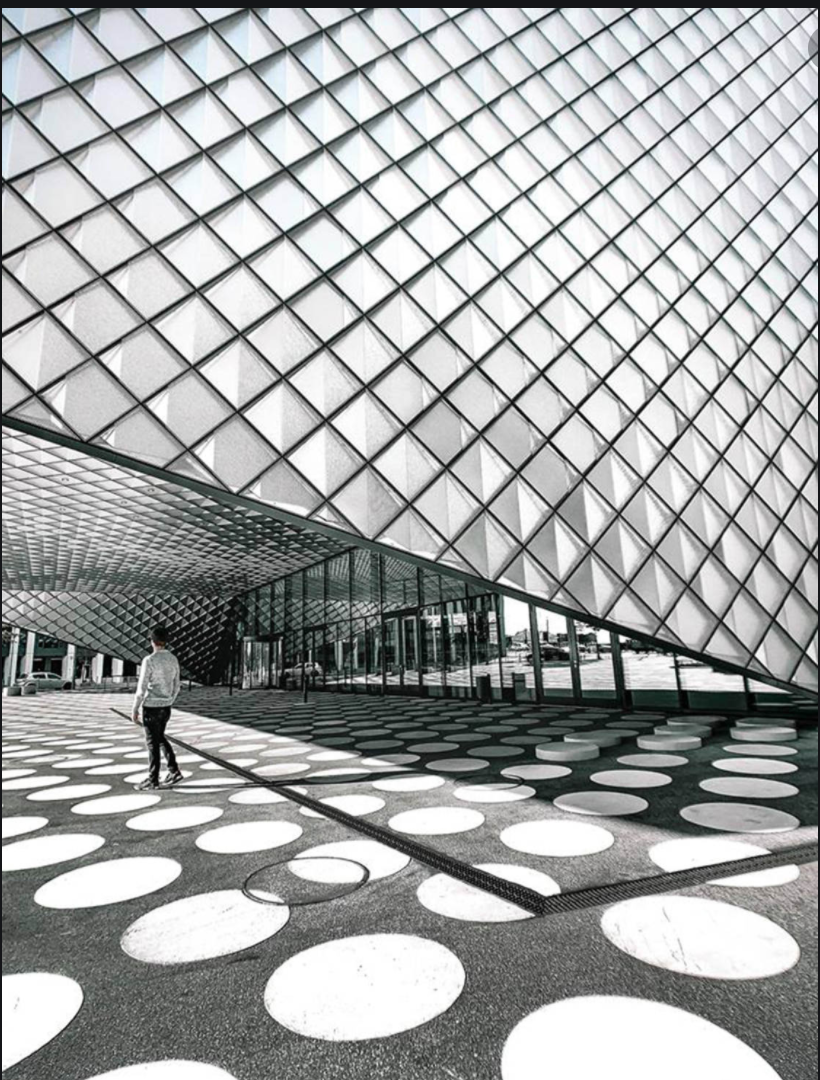
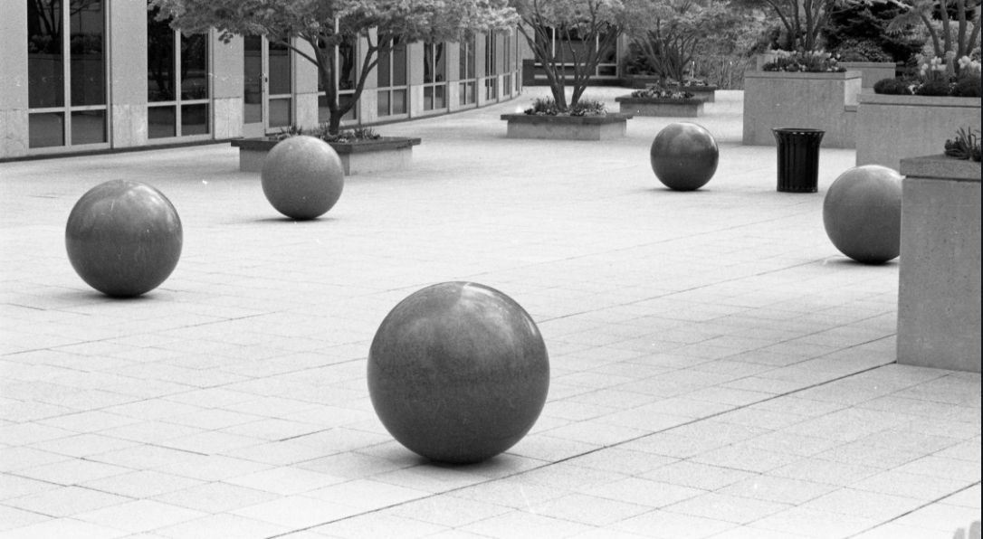
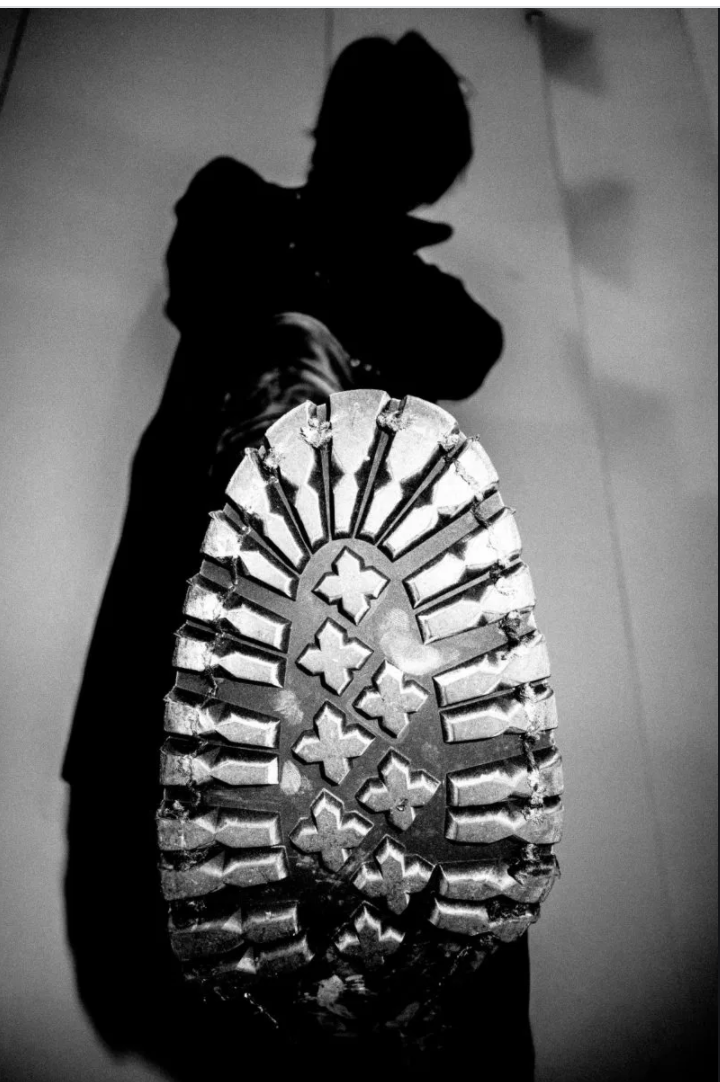
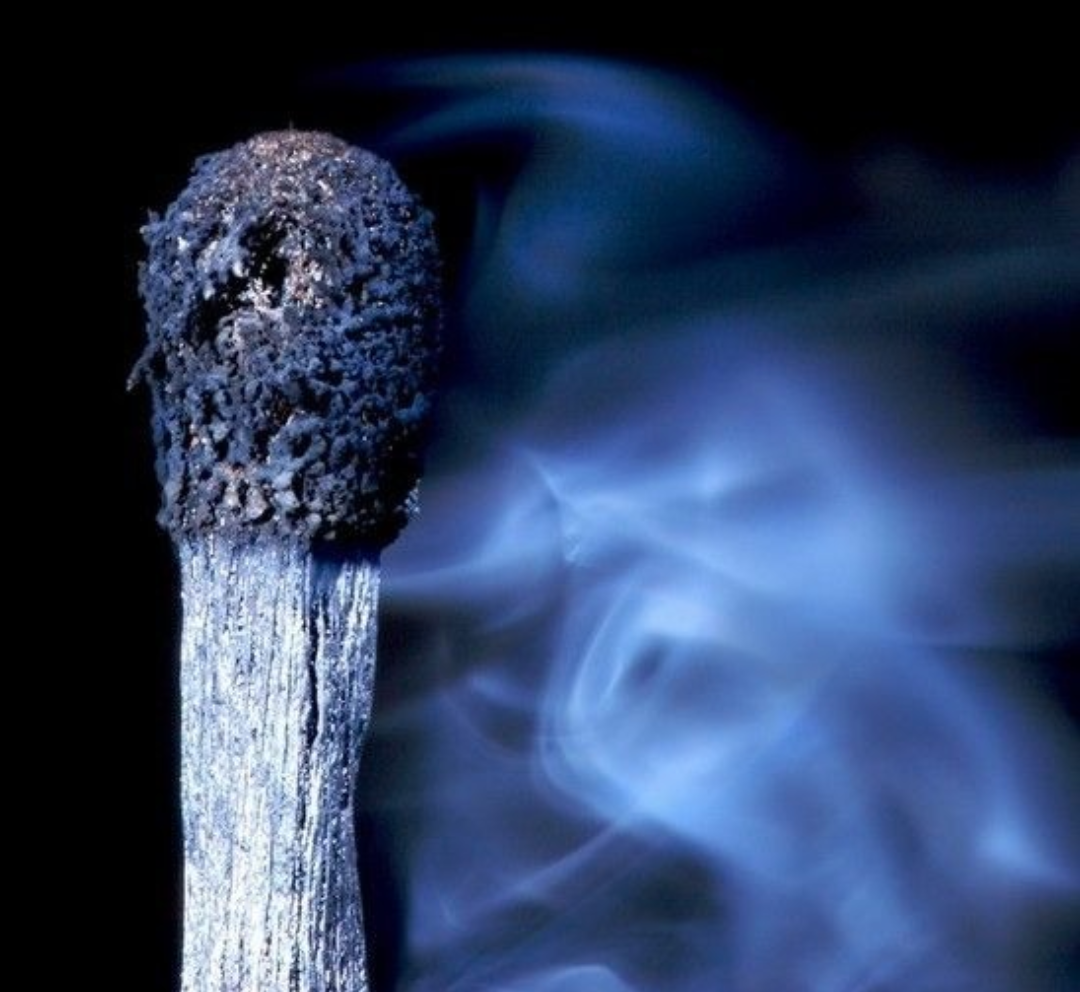
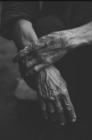
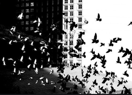
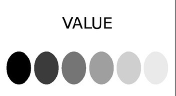
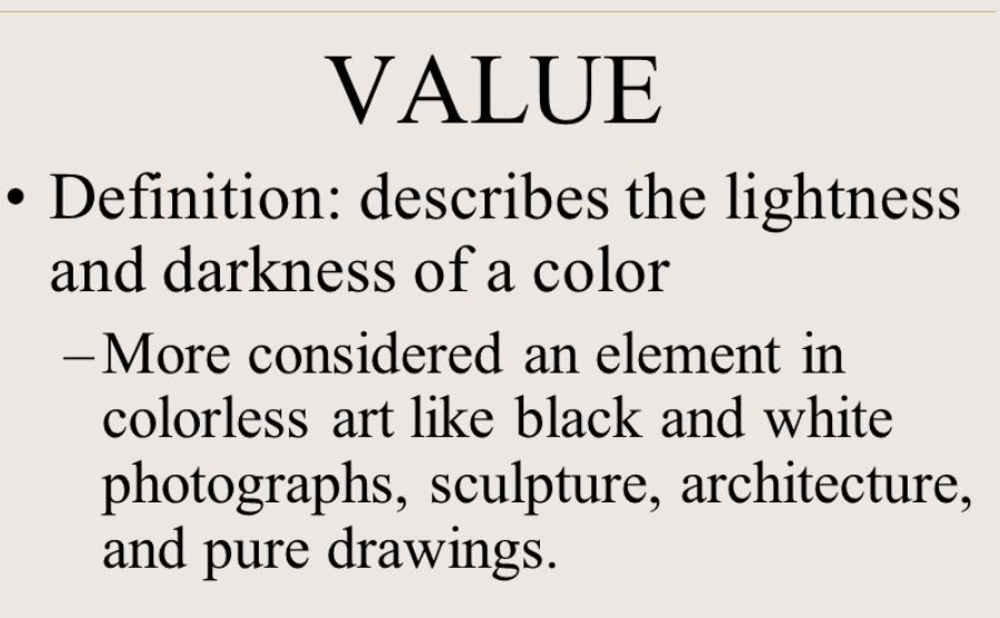
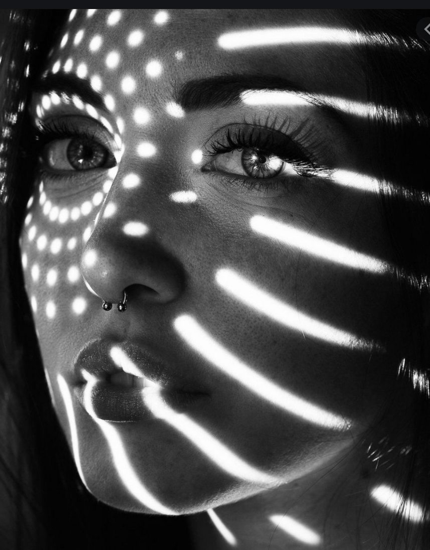
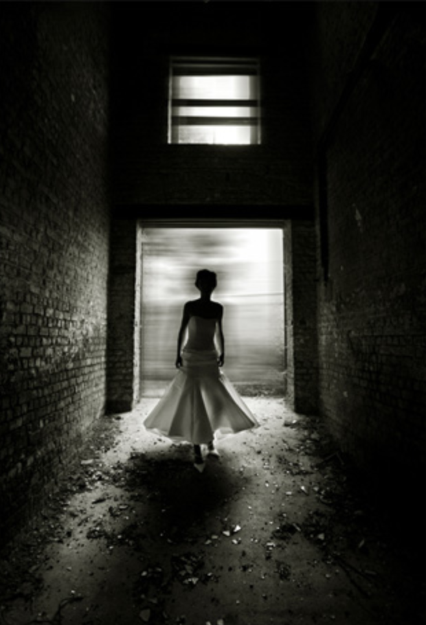
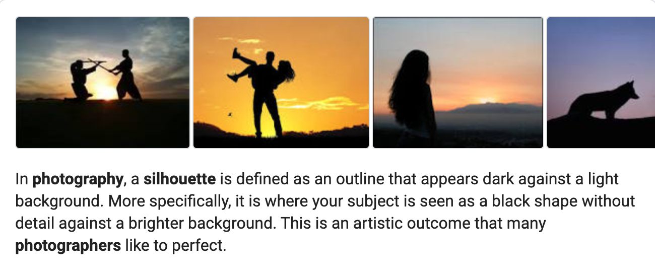
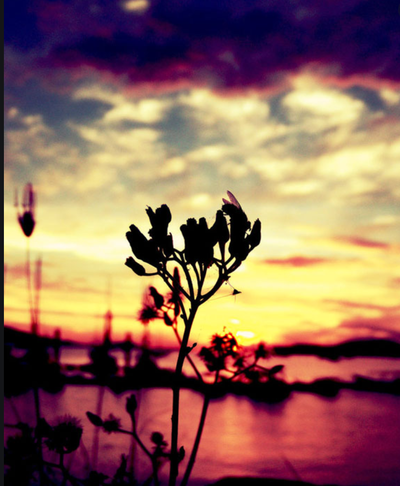
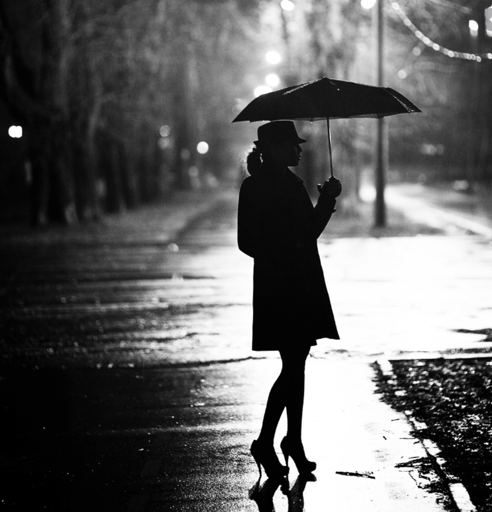
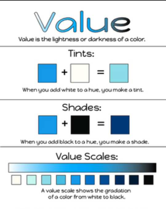
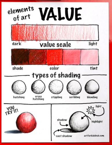
Next, we will look at Value or the lightness and darkness in a photograph, including using shadow and silhouette created by the direction of the light source.
Look around in your world to find interesting examples of texture that can come from nature or from man-made objects.
Assignment #1 for Week of April 7 - 10 - Take photos showing a variety of textures, choose your top 3 - 5 texture photos and email to Ms. Losness by Friday April 10, 2020.
Next, we will look at Value or the lightness and darkness in a photograph, including using shadow and silhouette created by the direction of the light source.

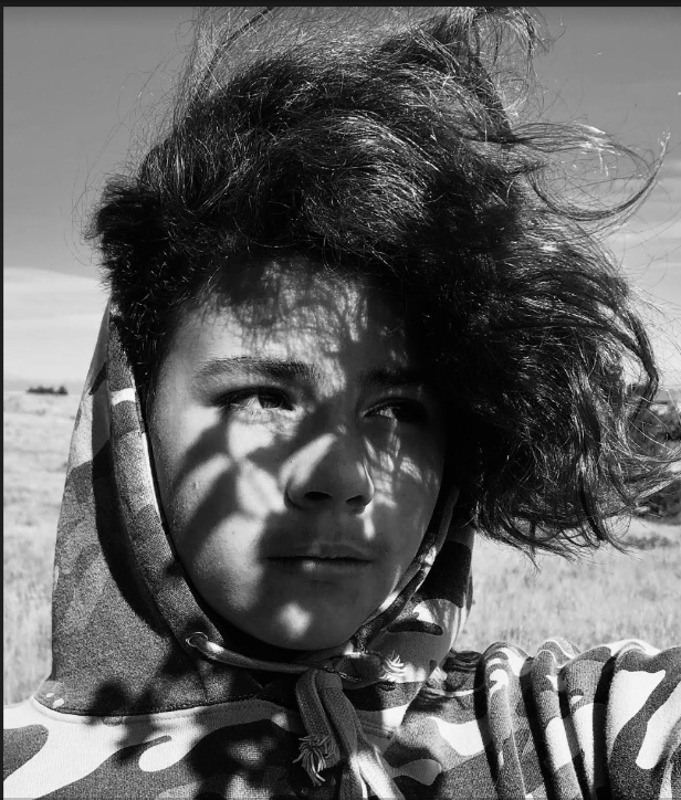
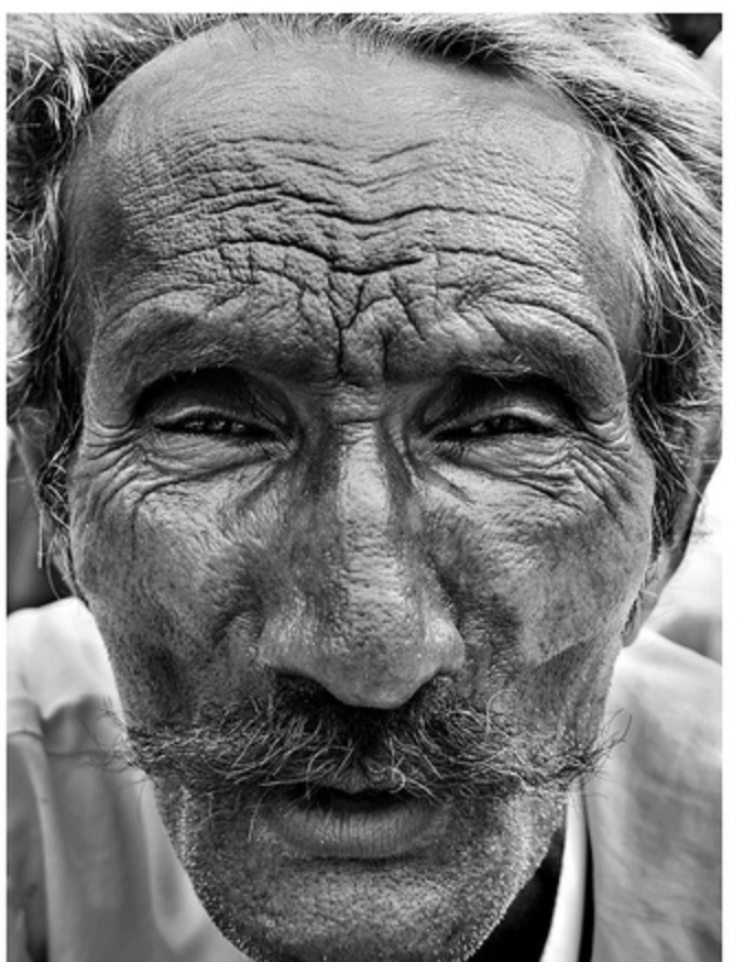
Jaxon M. 12/19 MRMS Art


|
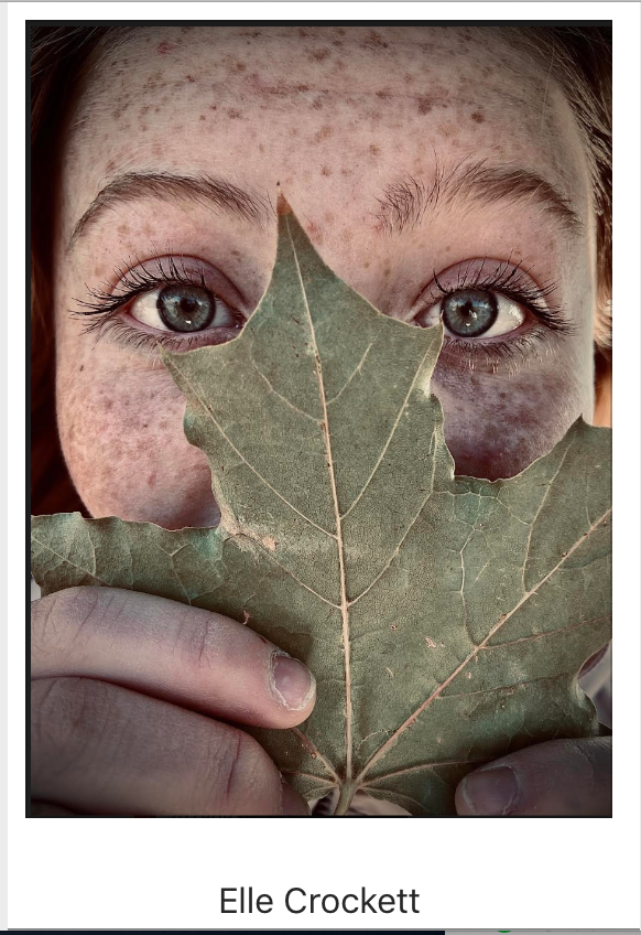
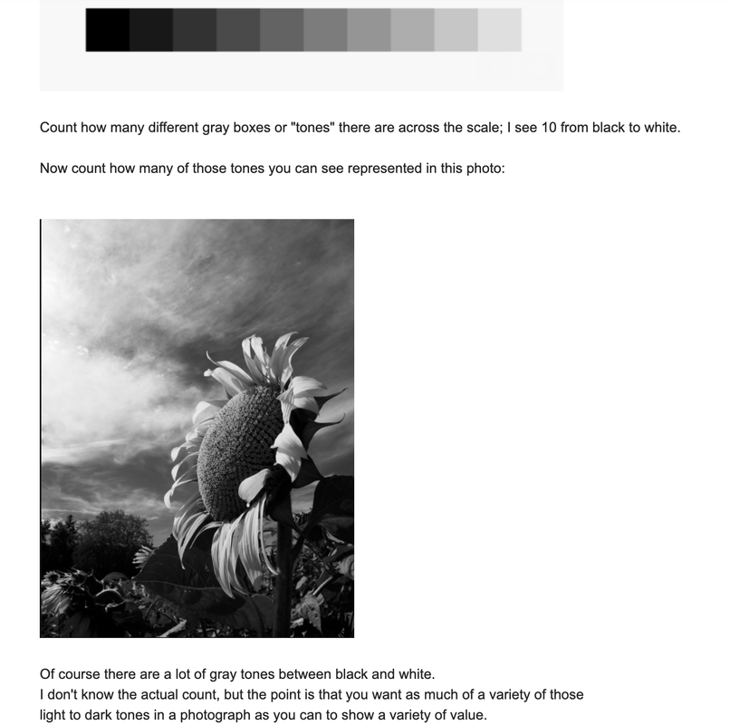
This photo of your classmate (Jaxon, left) was taken during photography lessons in Art first semester 2019. Count how many tones of light, medium and dark grey values there are; the more variety the better.
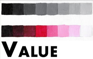
Photography showing value can have shadows or silhouettes in the photo depending on the direction of the light source, but it is not a requirement. A photo with good use of Value has a variety of light, medium and dark tones of black & white OR of a color scale. It does not have to be a black & white photo because a photo can also have light, medium and dark tones of a color. 


|


Assignment #2 for Week of April 7 - 10 - Take photos showing a variety of values, they may include silhouettes and/or shadows. Choose your top 3 - 5 value photos and email to Ms. Losness by Friday April 10, 2020.
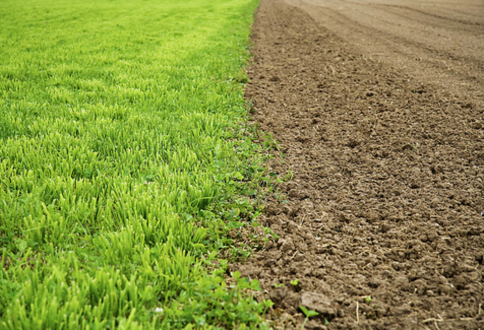
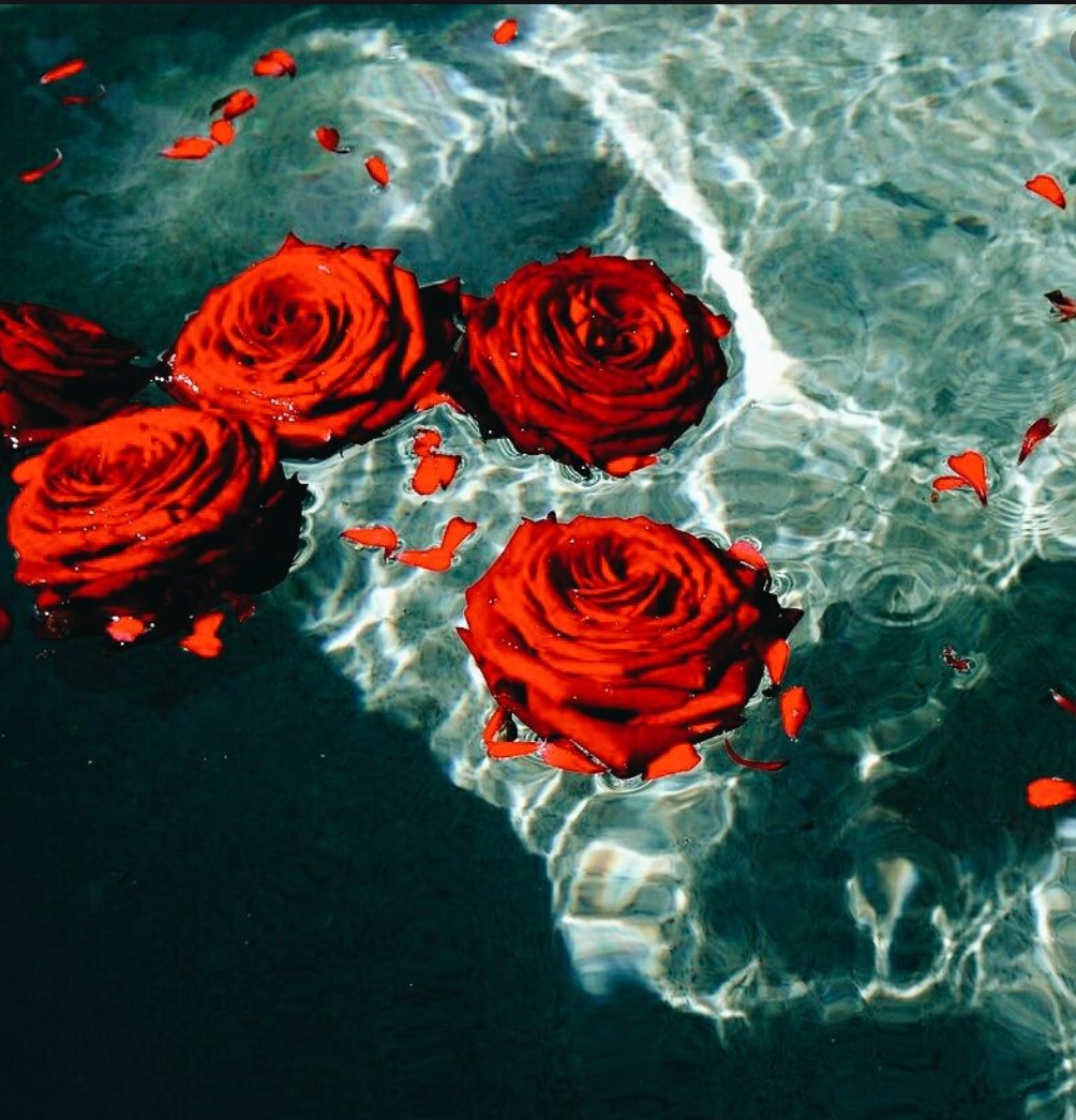
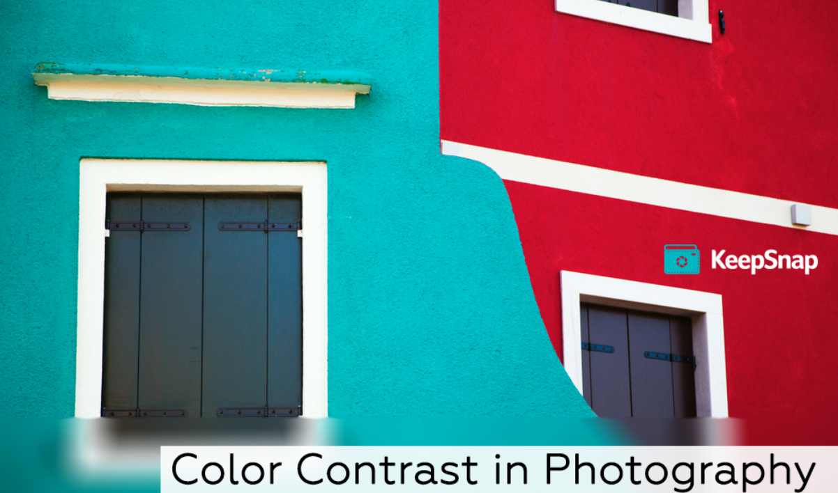
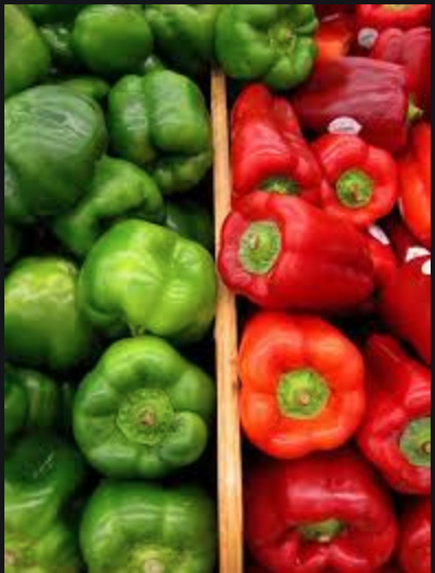
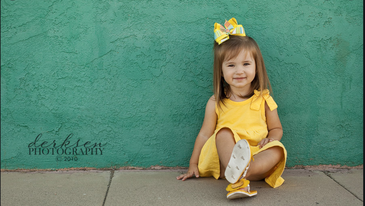
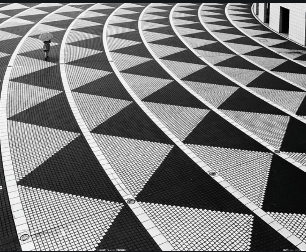
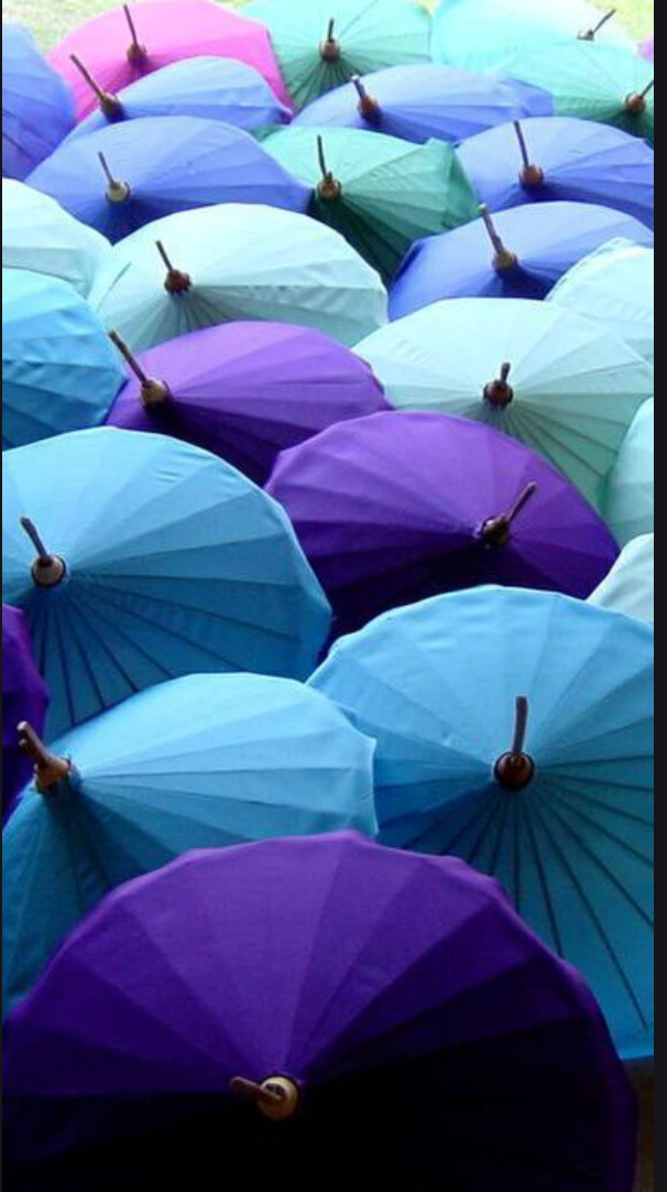
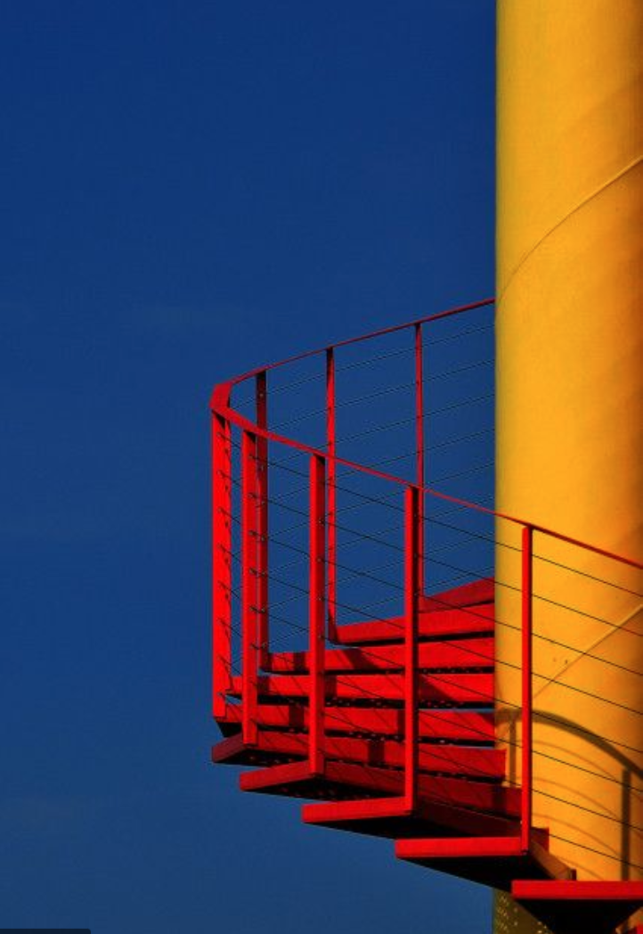
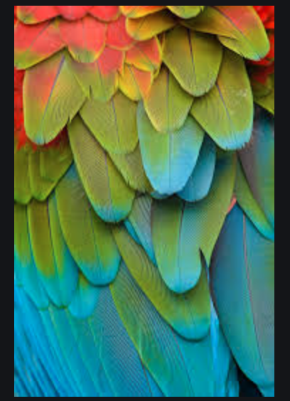
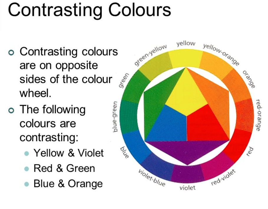
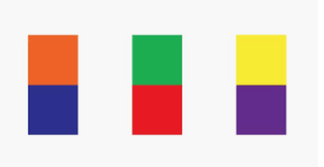
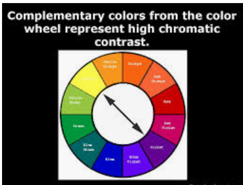
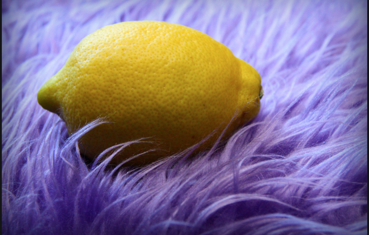
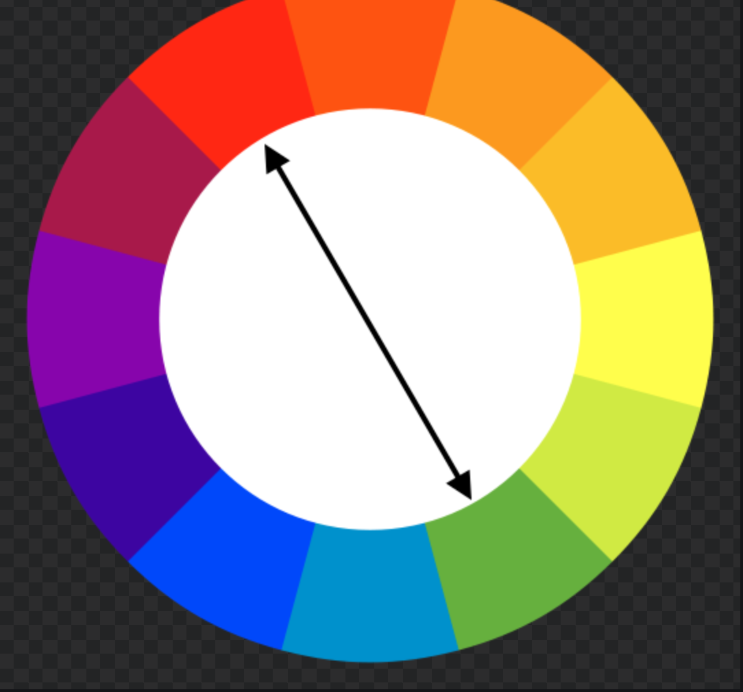
COLOR
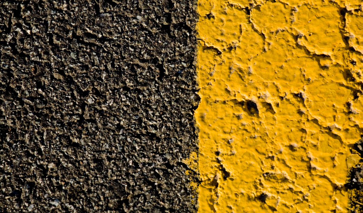
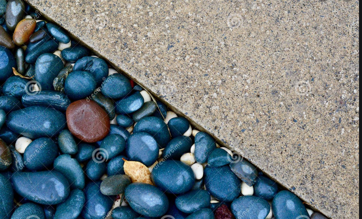
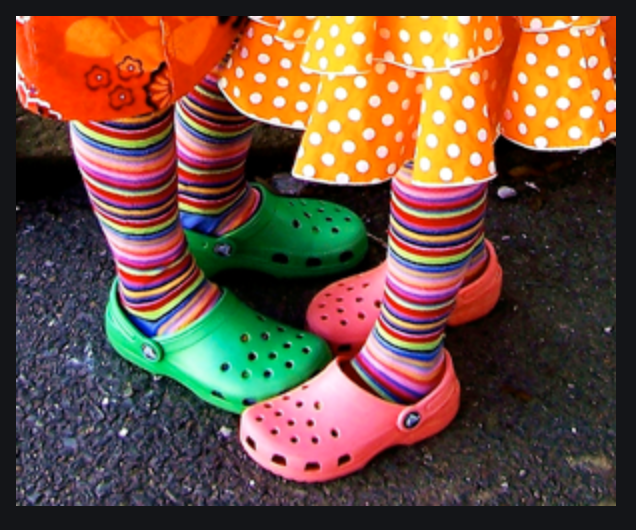
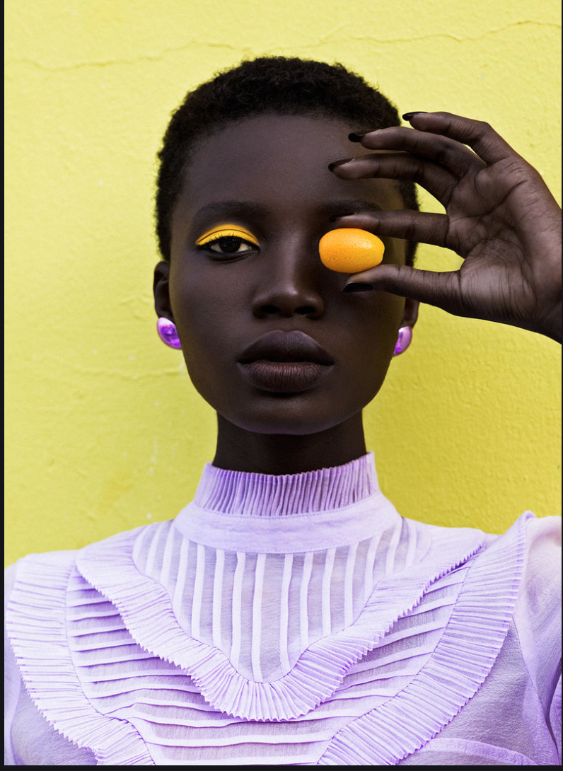
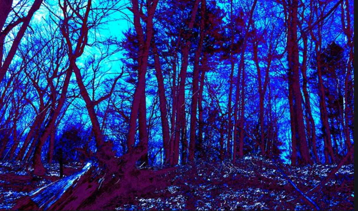
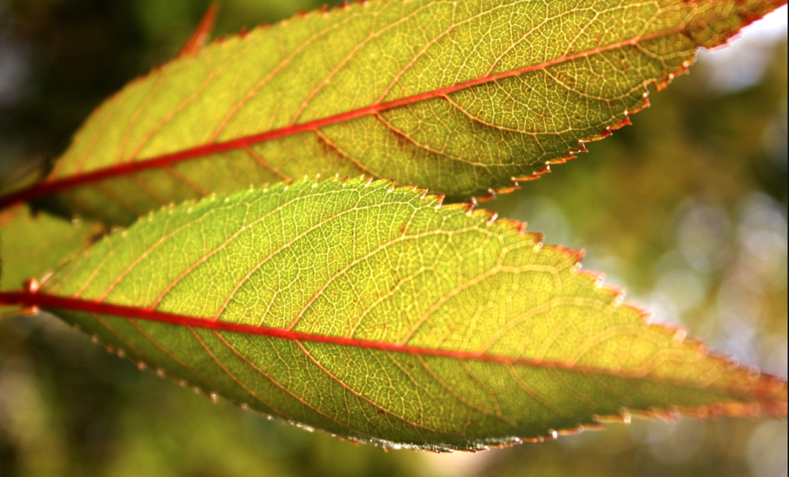
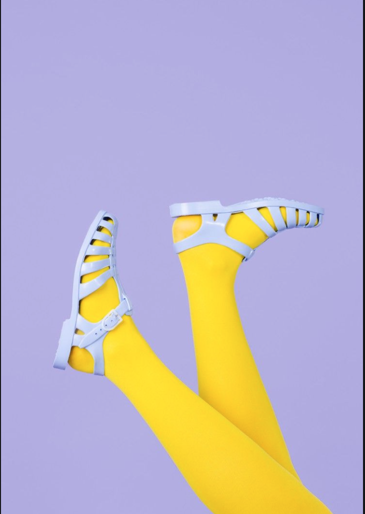
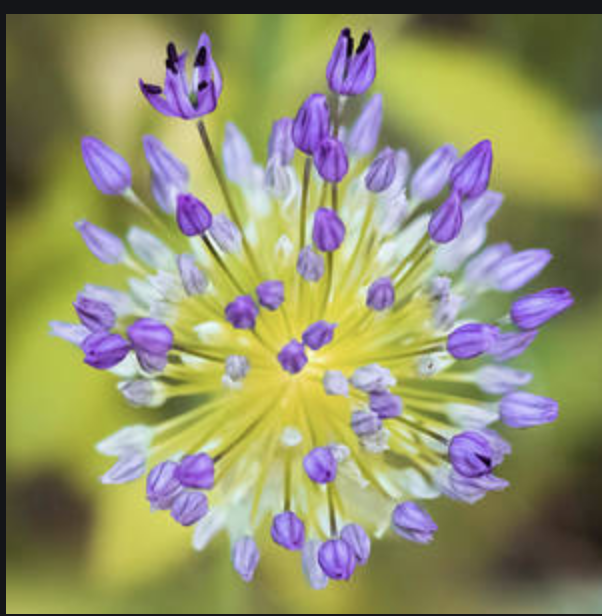
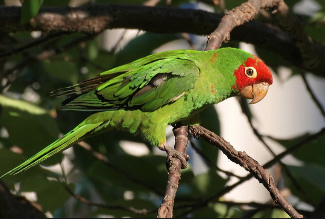
As we have seen above, color can be used in photography as a monocolor ("one" color) in a value scale of light to dark tones of one color. Color can also be used by looking at the color wheel and choosing groups of colors to create contrast or mood. There are three groups of complementary or contrasting colors; colors that are opposite each other on the color wheel: green and red, yellow and purple, and blue and orange. When used next to each other, they create contrast.
Assignment #3 for Week of April 7 - 10 - Take photos showing a combination of contrasting colors, choose your top 3 - 5 contrasting color photos and email to Ms. Losness by Friday April 10, 2020.
COLOR
As we have seen above, color can be used in photography as a monocolor ("one" color) in a value scale of light to dark tones of one color. Color can also be used by looking at the color wheel and choosing groups of colors to create contrast or mood. There are three groups of complementary or contrasting colors; colors that are opposite each other on the color wheel: green and red, yellow and purple, and blue and orange. When used next to each other, they create contrast.
Assignment #3 for Week of April 7 - 10 - Take photos showing a combination of contrasting colors, choose your top 3 - 5 contrasting color photos and email to Ms. Losness by Friday April 10, 2020.


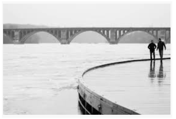
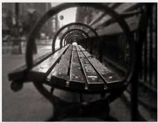
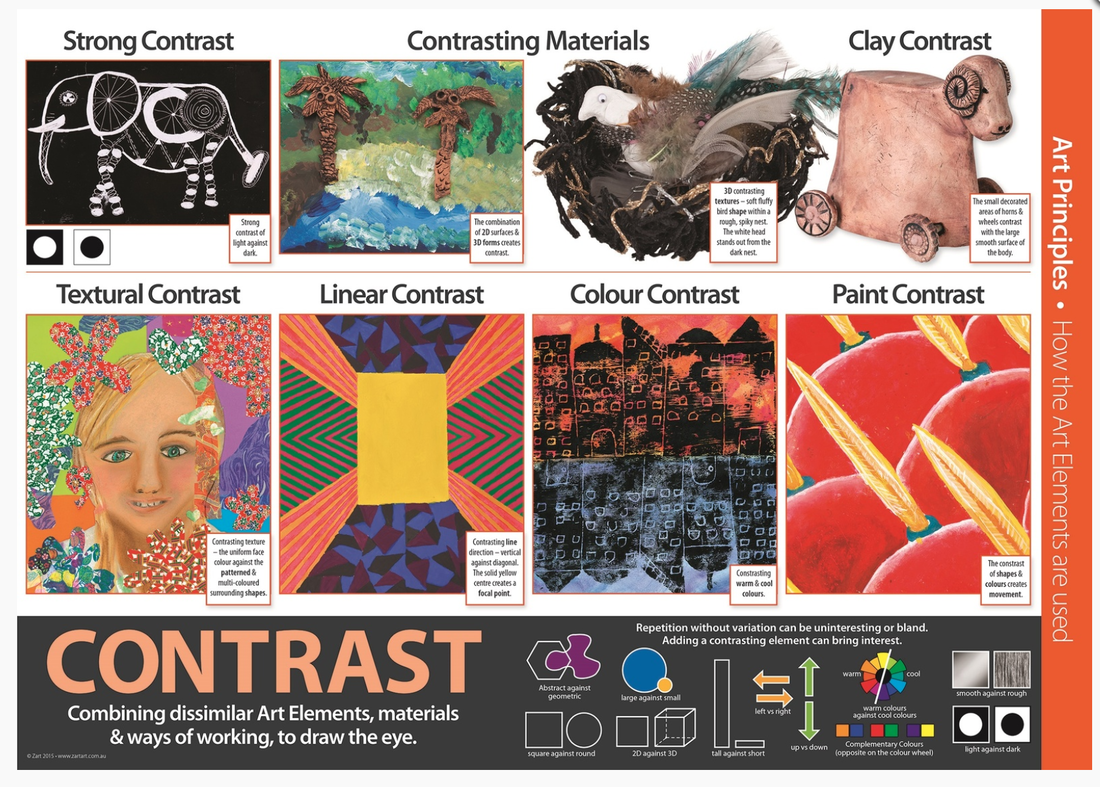
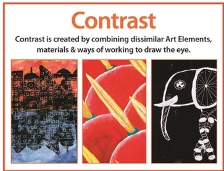
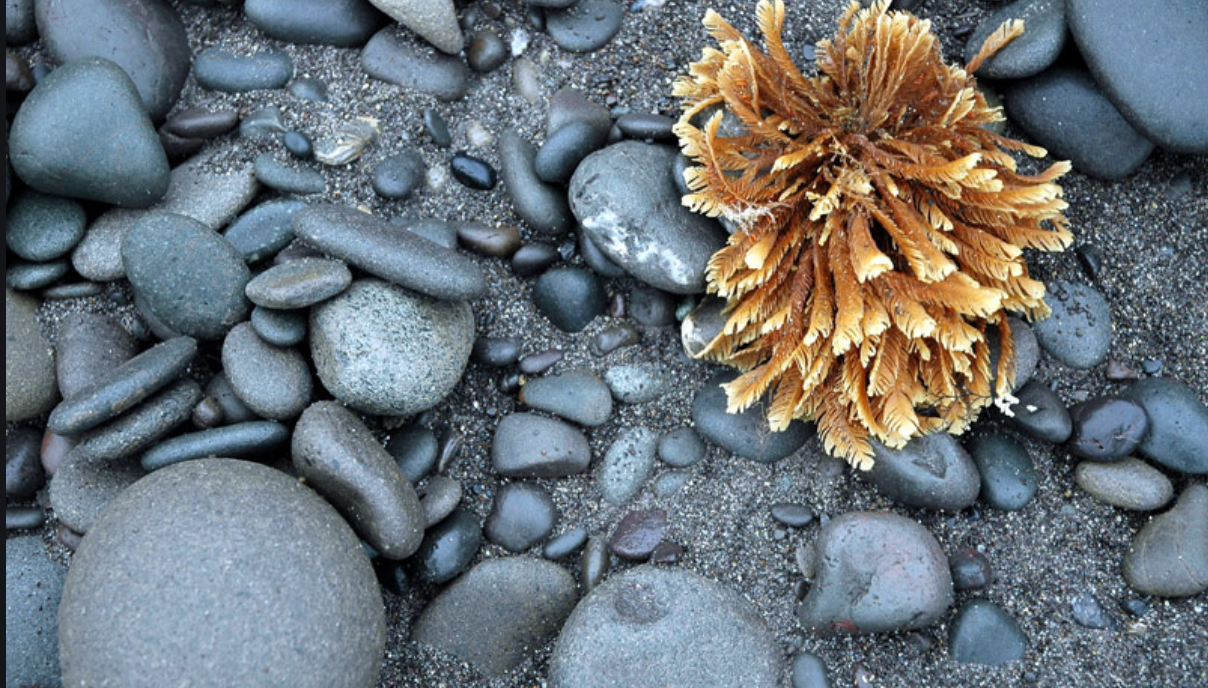
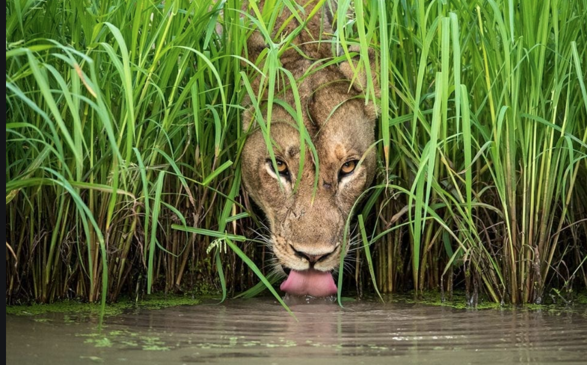
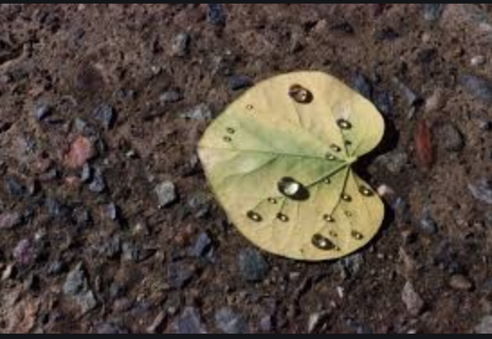
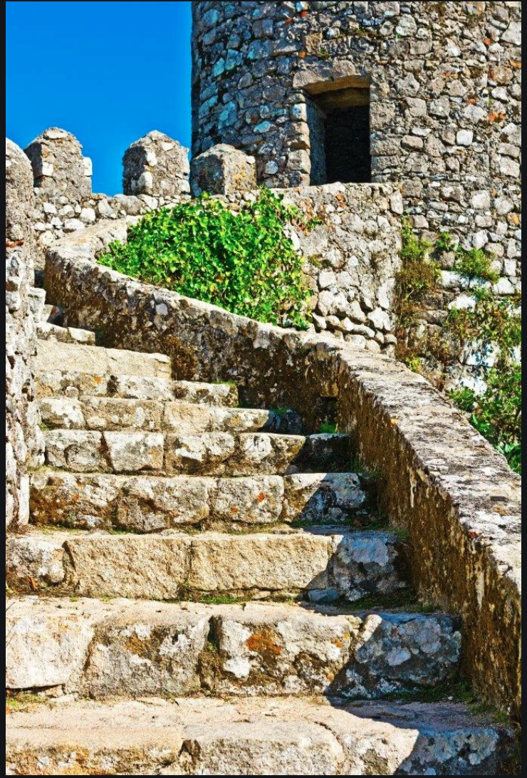
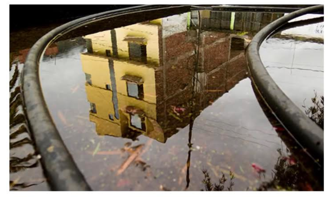
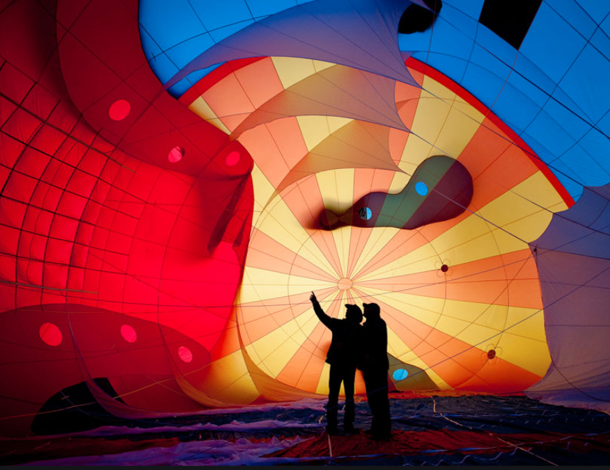
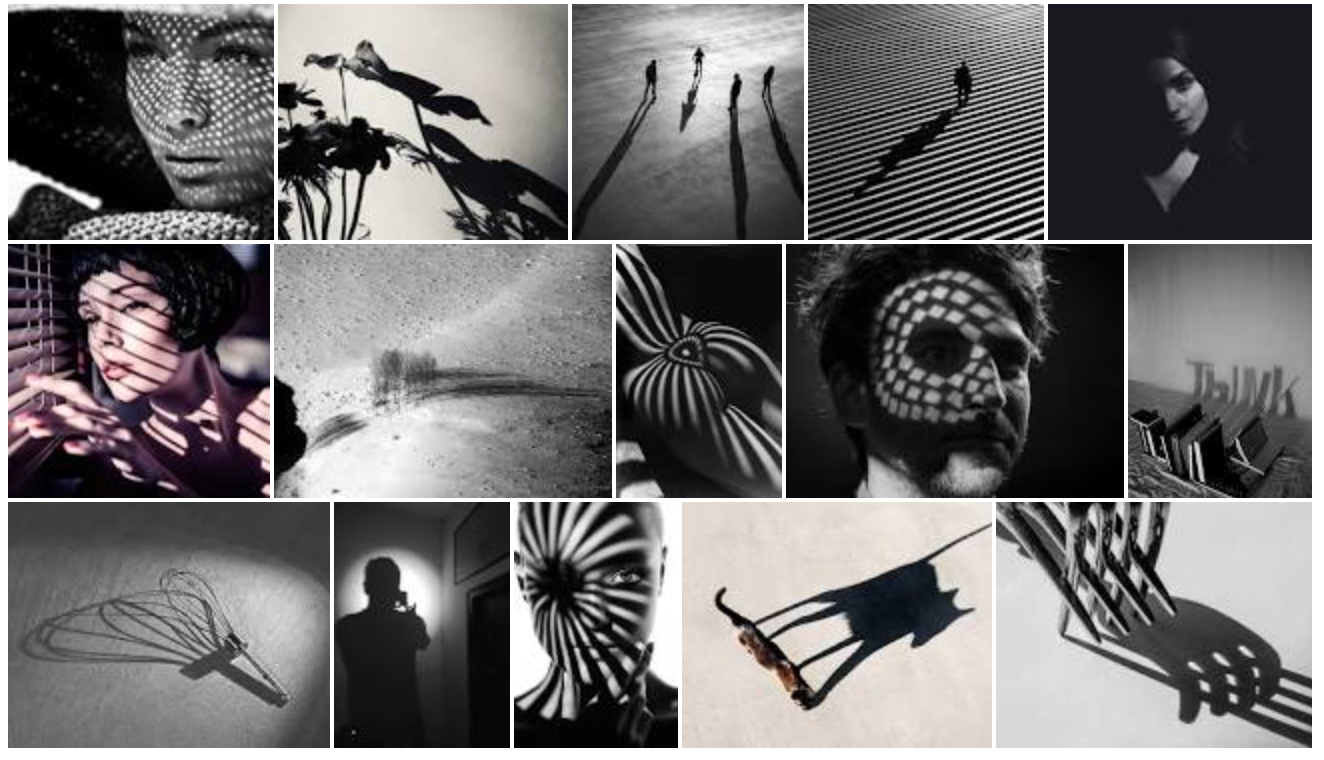
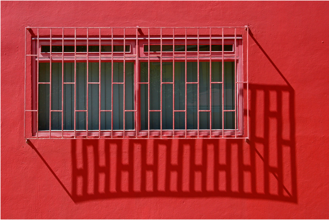
Contrast and Combine Art Elements
Assignment #4 (last of 1 - 4) for Week of April 7 - 10 - Take photos using a variety of combinations of the 7 Art Elements we have covered so far; 1.Line, 2.Shape, 3.Form, 4.Space, 5.Texture, 6.Value and 7.Color
In these photos choose two or more of the 7 Art Elements to use by combining and/or putting them next to each other for contrast. Look at the examples below of different art elements combined or placed next to each other for contrast.
This is the final #4 assignment from 1- 4 of the assignments due for this week April 7-10. Take 3 - 5 photos using a variety of art elements and email to Ms. Losness by Friday April 10, 2020.